A special wedding shoot.

I saw a request on a local site called Neighbourly which is like Facebook but only amongst people in your immediate neighbourhood. Linda made this post. Images now available as NFT’s.

post.jpg

I couldn't resist offering to photograph this special occasion for free, just for the privilege of being there. The celebrant Gareth Duncan was initially volunteered by his wife but was glad that she was so quick to respond and was happy to do it at no charge. A reporter turned up as well and asked for some images as soon as possible for their story on stuff.co.nz  and I sent a few small size samples but when they made their choices I forgot to edit those as well before sending them off - besides the reduced quality of the website images the lighting was not the best. Because the weather has been so hot I discussed options with the celebrant, Gareth, and we chose to move the whole party under a large tree which was actually quite dark, especially compared to the bright sunlight at the time.

aWedding0725.jpg

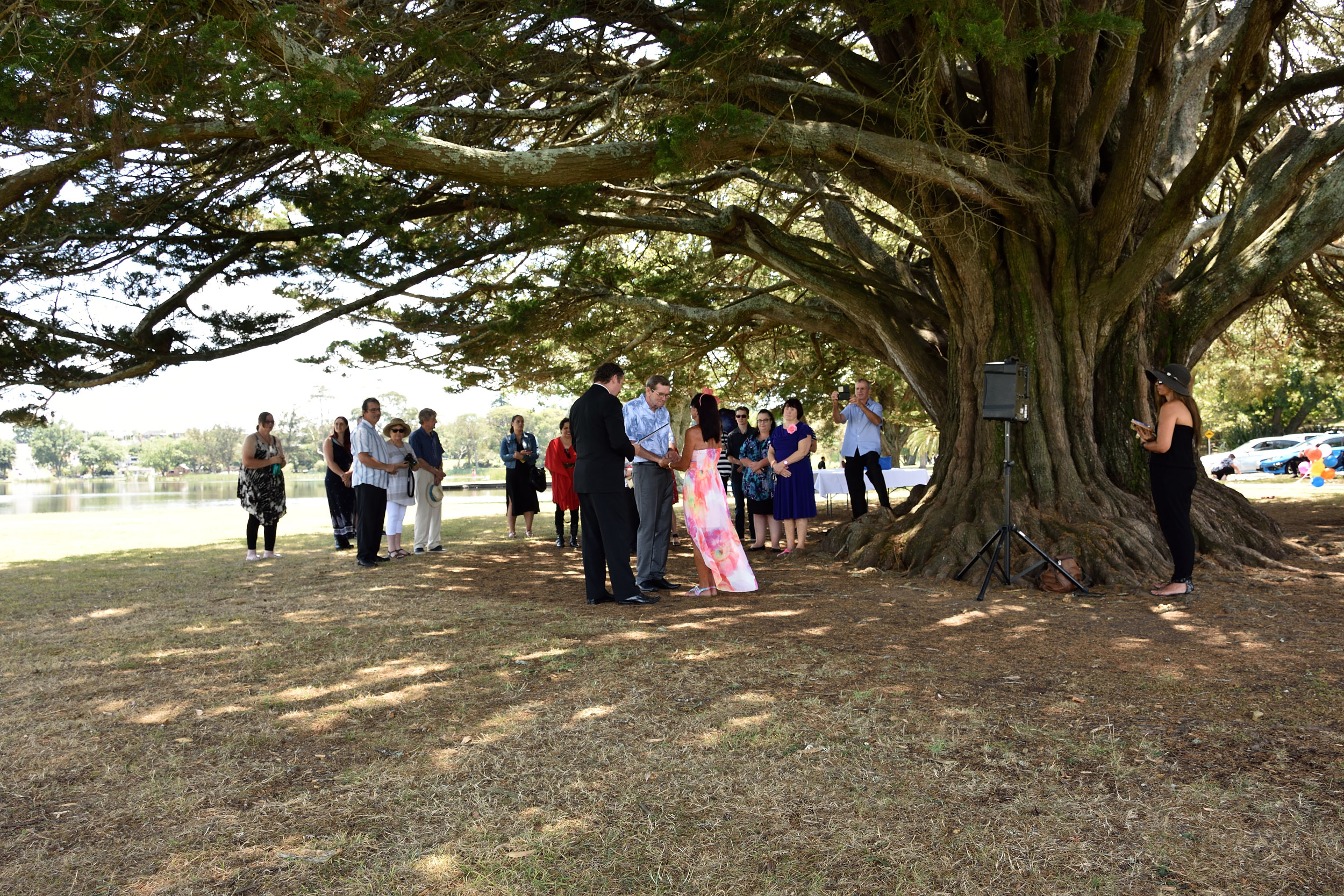
I had been pleased with the overcast weather of the morning thinking the shoot was going to be easy, only for the sun to come out in full force during the ceremony and then, once it was all over, it clouded over again with nice diffused light. That's how it goes with wedding photography, you can't choose your lighting during an outdoor ceremony which is probably why I normally prefer high speed photography. The ceremony was held at Hamilton lake in New Zealand. Originally Linda wanted to have it on the other side of the lake near a nice half-moon shaped brick bench/structure but because it was a narrow area close to the road there wasn't much space for any extra people who may turn up, so the celebrant suggested we move to the other side where there was a nice open area that could take a lot more people. 


We were right under this tree....

arrow.jpg

Flash had to be kept to a minimum along with close-ups. We had been asked to be very discreet as "Micky can get upset quite quickly" so we had the 18-200mm on Lisa's D7000 and though I had the Sigma 18-35mm f1.8 on my D7200 it was mostly too wide for the situation so I resorted to the 18-140mm lens on my other D7200. No point having ultimate sharpness and quality with a wide prime in that situation while upsetting the couple. Though I know everyone says "primes give better quality" etc. but at this particular wedding where we were asked to keep our distance the zoom lenses allowed us to be discreet while also allowing the occasional wide shot without having to change lenses. I was quite happy with the results from the 18-140mm lens.

aWedding0214.jpg

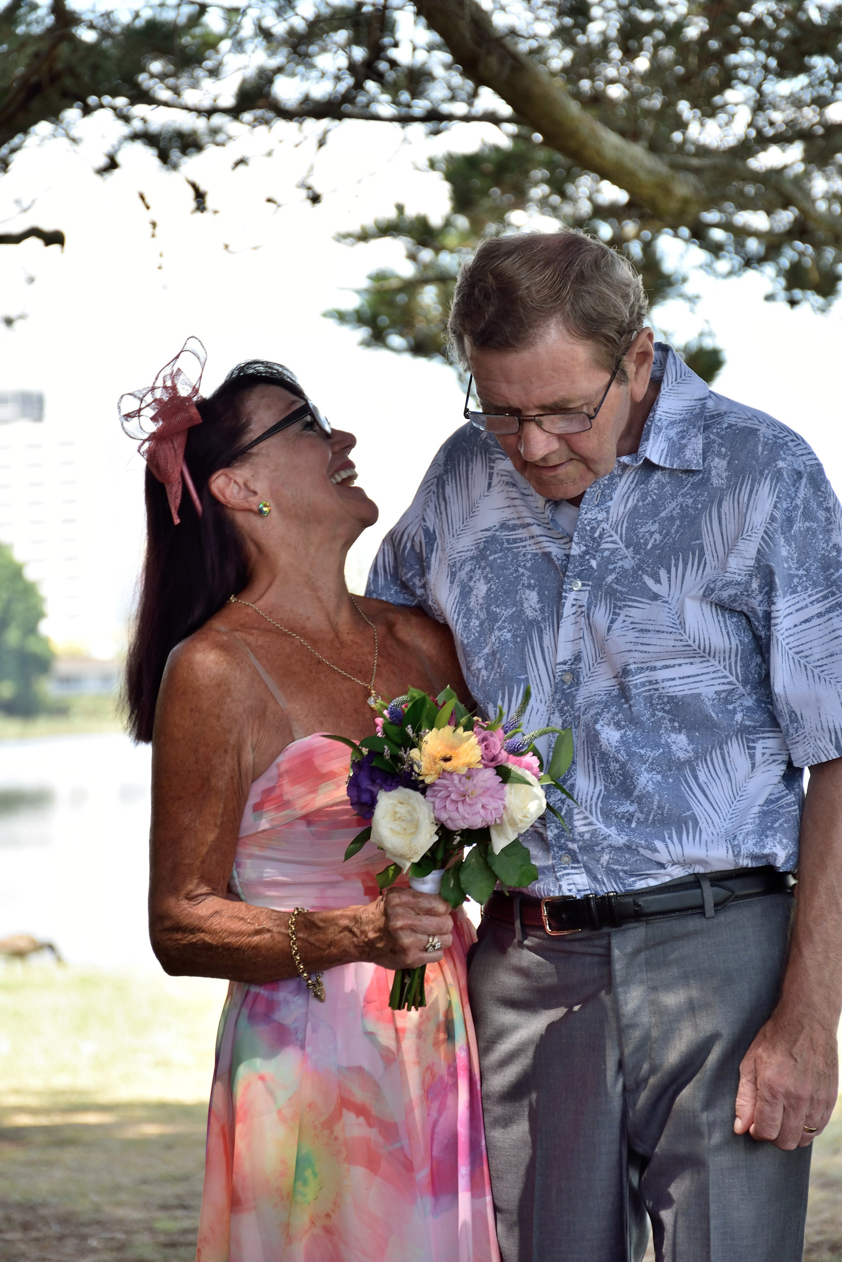
What really impressed Linda was the fact that although Michael has a really bad memory the morning after asking her to marry him he asked if they were still going to go ahead with it, and on the morning of the wedding when we met at the car she told me that when they woke up that morning Michael said [add Scottish accent] "Today's the day!".

Normally I wouldn't dream of photographing a wedding without meeting with the couple first but Linda was concerned about making Michael feel too pressured so in line with being especially 'discreet' for a particularly sensitive situation that was all 'last minute' I had to settle for simply meeting on the day as they walked to the spot. Everything went just perfect!

aWedding0142.jpg

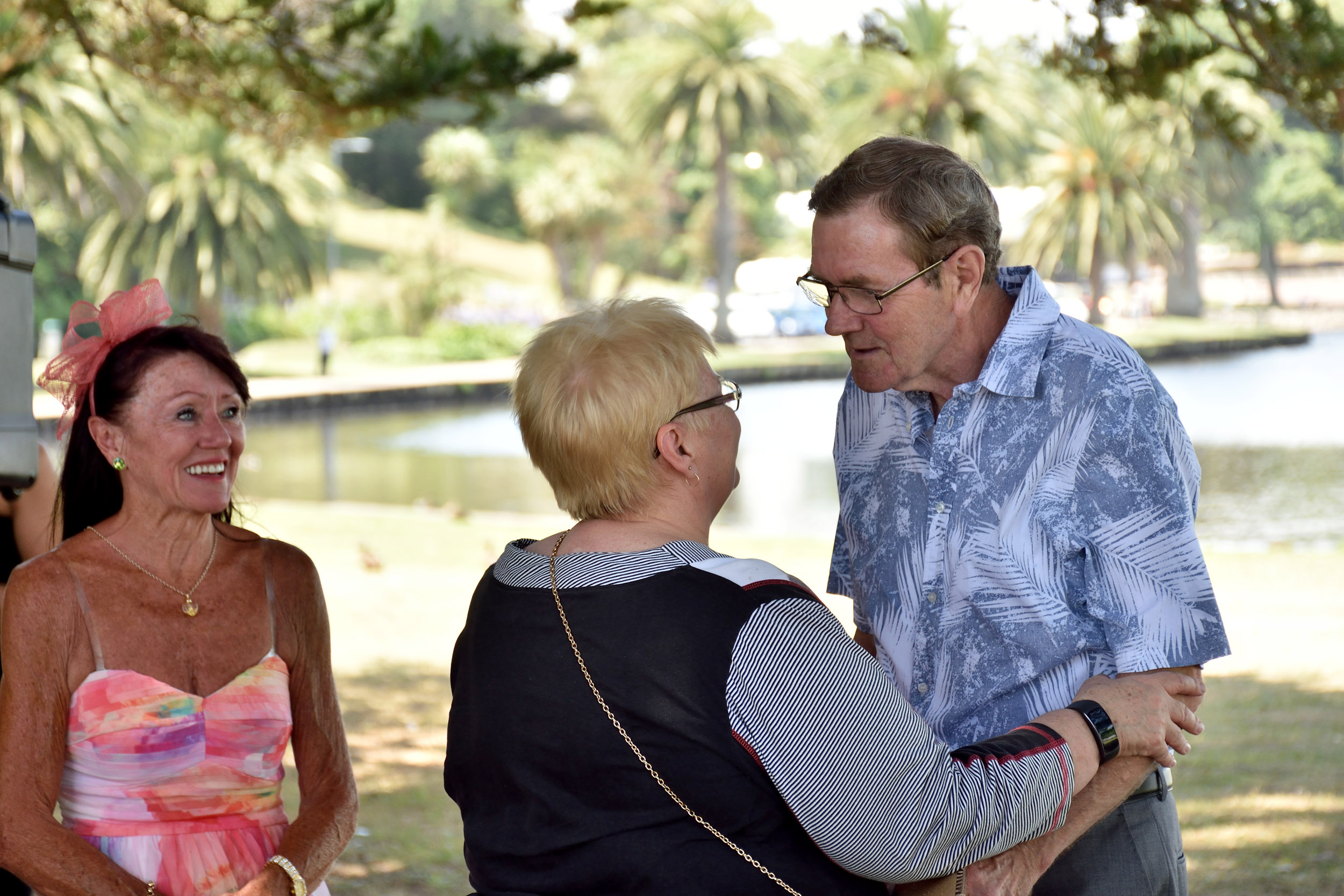
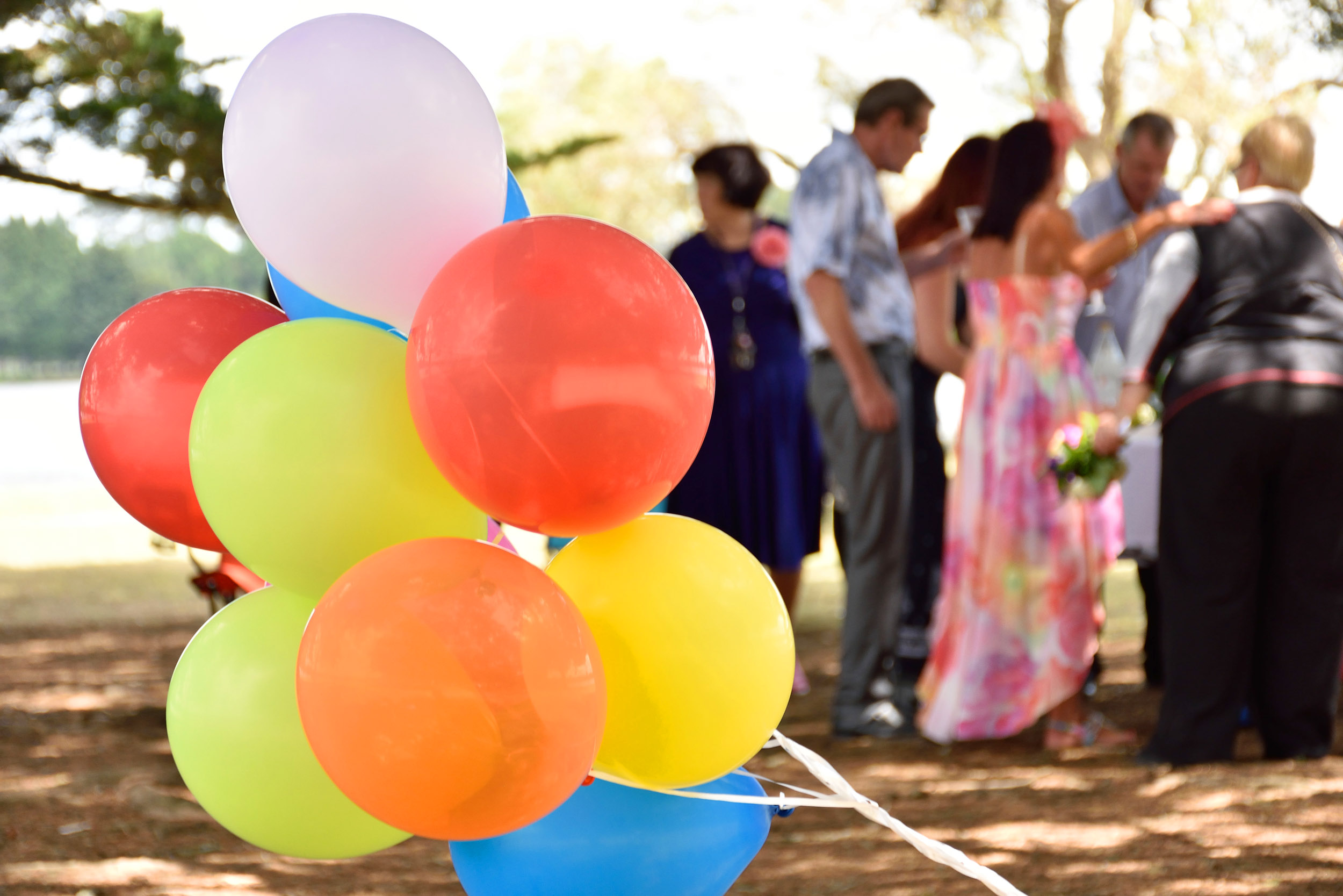
The party consisted of close family and friends but there was as much joy there, if not more so, than any other wedding I have been to.

aWedding0178.jpg

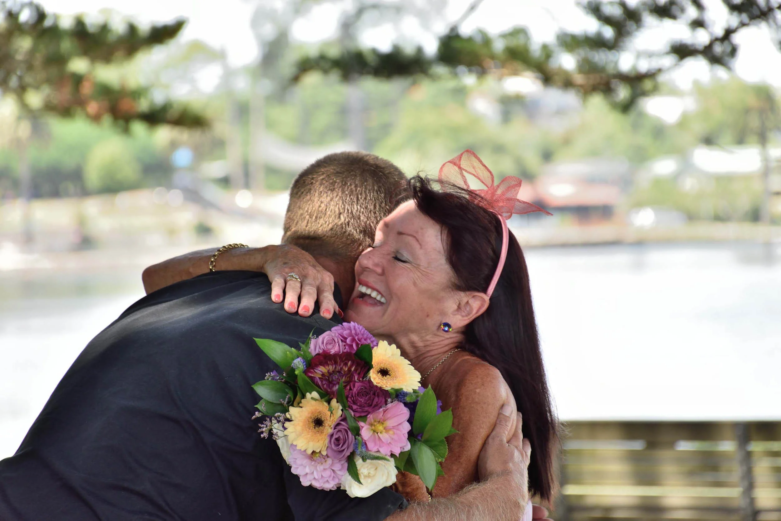
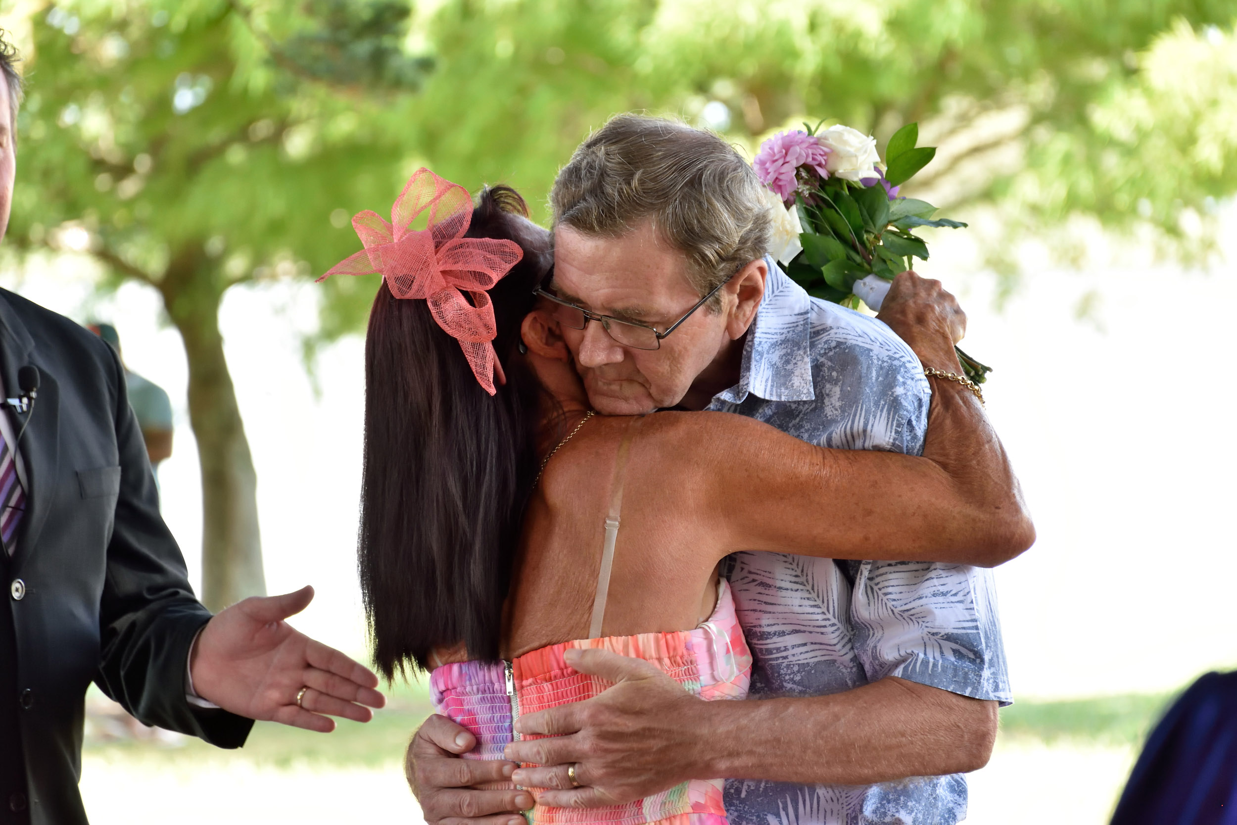
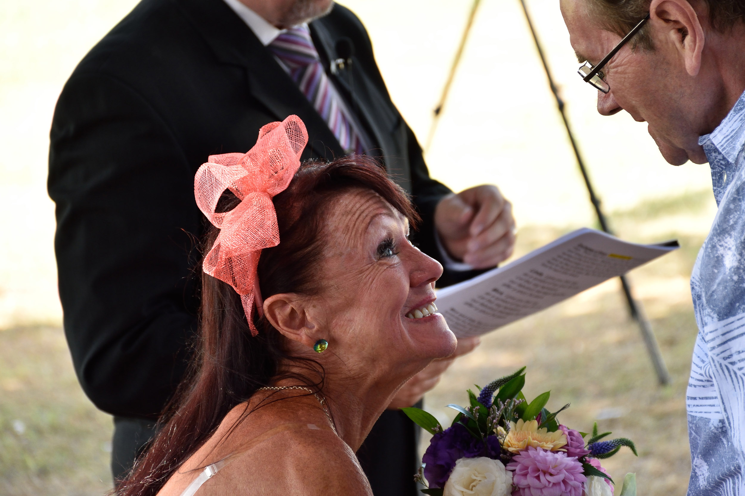
The ceremony went very well and there was a lot of added emotion to the occasion. From where I was standing I could see Linda mouthing the words "I love you" to Michael, several times as she stared intently into his eyes. The celebrant read Michaels vows to help him out, but to think that even in that state of not being able to speak the vows himself, he had remembered it was their [second] wedding day when he woke up that morning.

aDSC_5703.jpg

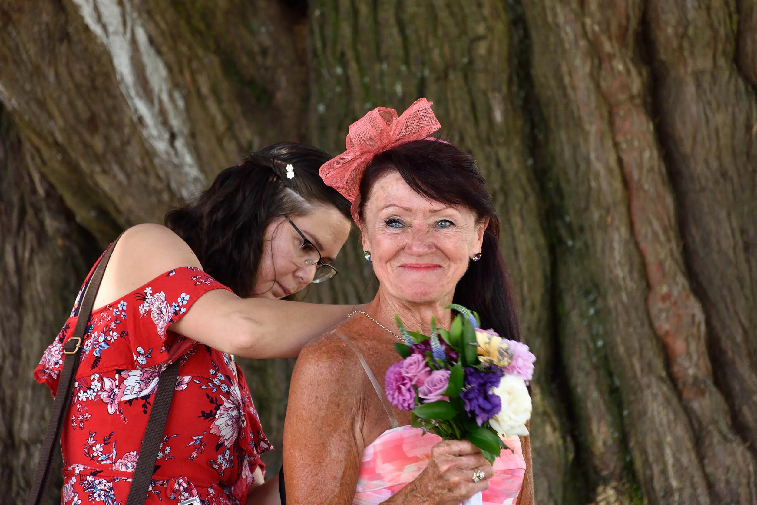
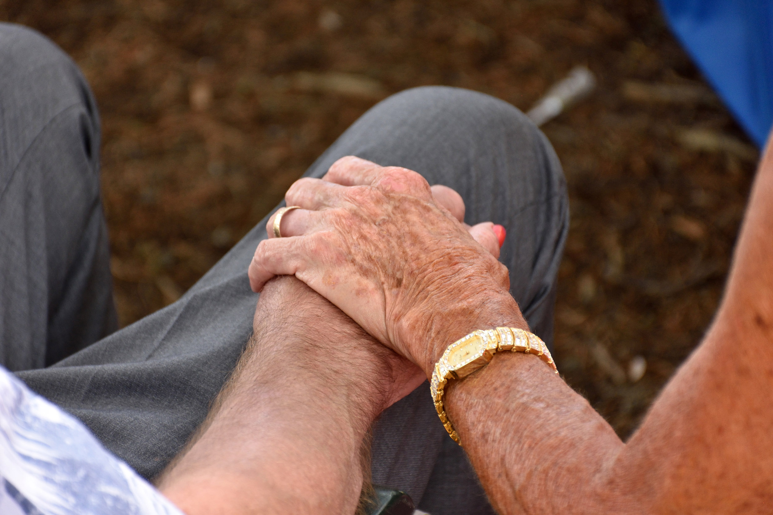
A close friend helped Michael put the ring on Linda's finger. The tissue had helped remove some of the "liquid emotion" that was starting to trickle down Linda's face as she went through with the ceremony purely to make her husband happy.

aDSC_5761.jpg

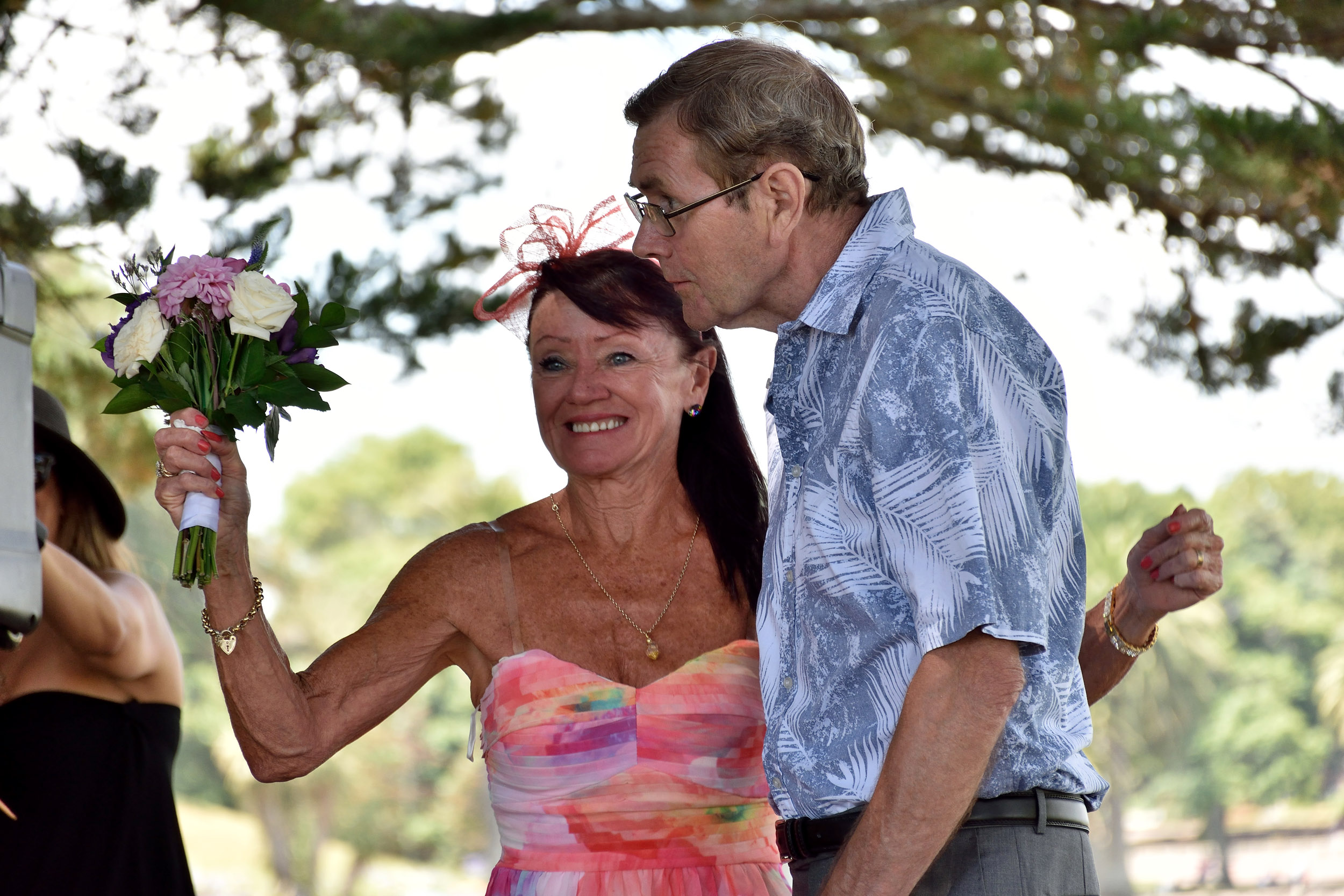
Just like newly-weds. [More pictures on my gallery]

aDSC_5782.jpg

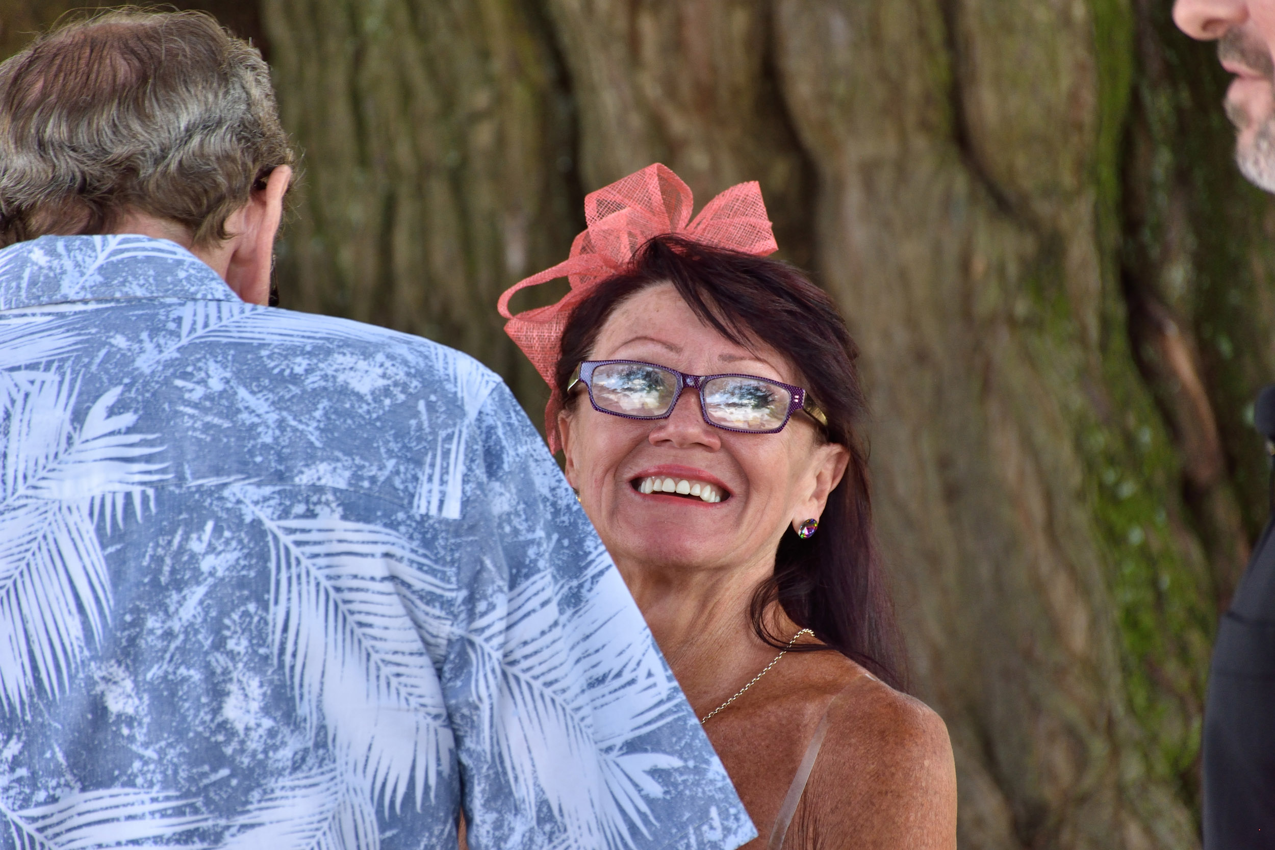
Having lively subjects always makes you want to keep taking pictures. Linda's face lit up with one emotion/expression after another, a dream to photograph. Normally when a couple are standing in the same place for a while you get 4 or 5 images then think "Not much point repeating these images" but in this case every few seconds called for a 'new' photo.

DSC_5822.jpg

When some of Michaels favourite Scottish music started played he was thrilled and lit up - also encouraging the guests to join in! I had left my little Nikon J1 on a tripod to record the event as a bonus but didn't have much time to monitor it so not the best quality but better than nothing I suppose.

I had taken a few pictures of their feet as a reminder - because once that music was playing quietly in the background Mick's feet wouldn't keep still - he wanted to dance! His one foot kept lifting off the ground in time with the music.

aaDSC_5875.jpg

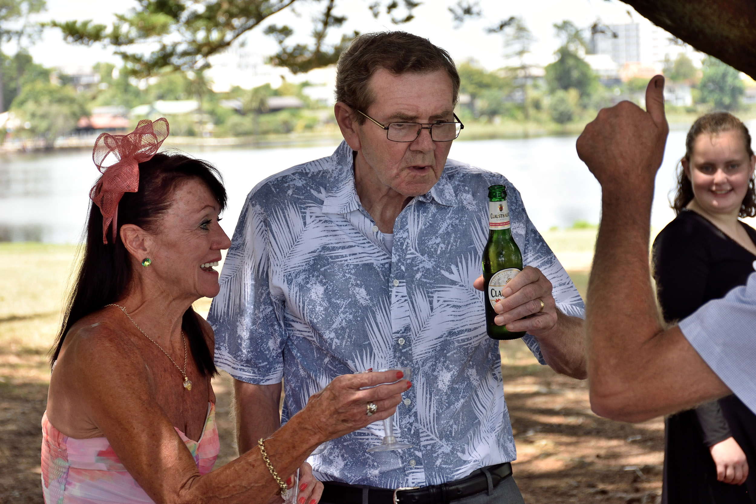
At one stage Linda and Mick turned around and she whispered to him "That's our photographer" and he gave me the thumbs up. I actually felt like that was more than enough payment for my time and efforts, it felt so good to be appreciated by this man. And to think, it didn't cost me anything to enjoy this event!

aDSC_5864.jpg

For video all I did was leave my little Nikon J1 on a tripod - not the most professional results but if anyone wants to see the whole 43 minutes it's here. 

There was this one moment just before we left where I was the only one standing out in the open and Linda was engaged in a discussion and Michael caught me out of the corner of his eye, as his expression changed and he slowly turned to face me directly I realised it was time to slip my camera behind my back and walk in the opposite direction. This was his day - I wanted nothing to spoil it. I must say I did find it rather amusing afterward and it reinforced in me why Linda had specifically requested that we remain discreet with the cameras during the occasion. Well that kind of rounds off my story for the day - I imagine everyone will soon be reading about Linda's side of it all the women's magazines that will be sharing her story soon :)

thelook.jpg

All the best Linda and Michael - thanks for letting me be a part of your very special day!

Update: On Sunday 31 May 2020 I received an email stating that a song had been written about the occasion :) Deja Vu Wedding

Update: 2/06/2020 - after contacting Linda to give her the news about the song that was written about their wedding she informed me that “Mickey” ended up in hospital during the lockdown and passed away due to a heart attack a few weeks ago.


6 Months caring for an injured praying mantis - The Mantis story!

Screen Shot 2018-01-28 at 8.55.22 AM.png

Softbox comparison

A cheap softbox showing the difference between no flash, the softbox behind the subject and the softbox above the subject.

softbox.jpg

Eiffel Apocalypse

Burning the Eiffel tower with a potassium nitrate smoke bomb mix and zapping it with a 200 000 volt Marx generator.


Burning lens

The usual disclaimers: It was a faulty lens that took blurry pictures and wasn't worth having repaired. besides the fact that it's nobody's business if I want to burn something I own.


Add some potasium nitrate, sugar, outdoor torch fluid and sawdust to an old faulty lens - and make its last photography experience something to remember.

aDSC_5257.jpg

At first the flames were small. Adding torch fluid to the smoke bomb mix helps slow the burning process down but also makes it harder to light so I pushed some matches backwards into the mix to help it start burning.


aDSC_5259.jpg
aDSC_5265.jpg

I had the mix packed into both ends of the lens but it didn't burn all the way through so I ended up pulling the front of to light that separately afterwards.

aDSC_5267.jpg

The little Nikon J1 is useful for the videos.

aYDSC_5274.jpg
aDSC_5284.jpg
aYDSC_5312.jpg

War zone

Today I took some toy soldiers and a tank and shovelled some dirt into a baking tray and lit some potassium nitrate smoke bombs.


aDES_1195.jpg

The results came out ok but also showed me that there was dust on the D7000 sensor that I hadn't noticed before since I was shooting at f11 to get more depth of field with the smaller subjects and closer focusing. 


aDES_1128.jpg

The soldier didn't look so good, I needed to shave off the plastic moulding around him to make it look more real. Initially I had the scene located inside the garage, watched by Oprah, a very talkative black cat. She doesn't mind smoke and flames, she just moves a little further away when things get too smokey.

Then I took the toy tank and set it at an angle to look like it was being viewed from lower down, hopefully to make it look more real. I experimented with various settings ranging from 1/500th to 1 second to add some blur to the smoke as well.


aYDES_1178.jpg
aYDES_1174.jpg
aYDES_1183.jpg

It was lost of fun and luckily the neighbours didn't call the fire department, or police for now...

aDES_1187.jpg

As usual with most of my shoots I had the extractor fan going to clear away the smoke :)

aDES_1234.jpg

Exposure

When I got my first decent digital camera I would take a picture, look at the resulting image on the screen and think to myself ‘Oh, so that’s how it is supposed to look then?!’ fully believing that such an expensive camera must obviously know exactly what it is doing and would therefore give me a perfect exposure. How wrong I was, even in its most advanced modes the cameras’ metering system is only the result of a computer program, written by an imperfect human being trying to work out what the camera will be pointed at and what the main subject will be, based on many variables that are impossible to predict in absolutely every situation. Is the subject the bright mountains in the distance or the person standing in the shade of the tree? Which is more important in the final exposure? Is the person under the tree important to the photographer or just another tourist getting in the way? For that matter the photographer may have the camera on a tripod and want an image exposed perfectly for the background first and then for the subject under the tree to combine them later in editing software. Obviously some of these variables cannot be calculated by the limited electronics of a camera, or even for that matter by another human standing next to the photographer, unless he can read minds. This is one of the reasons why the hardest part of photography for most beginners is getting the correct exposure – or even understanding what is ‘correct’ exposure. 

Here is an image and its associated histogram just to show a few basics. 


sunset.jpg

This is what the histogram looks like. A spike on the left representing black with no detail, a spike on the right representing white with no detail, and then everything else goes in between them with darks on the left, lights on the right and mid tones in the centre. 


sunsethisto.jpg

Here are some more images, along with some more histogram basics, that should help to explain why it is so difficult for manufacturers to write a program to give correct exposure in all situations. Have a look at this image and the resulting histogram. On the left of the histogram we have the dark part of the image and on the right we have the light part of the image, shown as two separate ‘hills’. So what is this picture of? 


blackwhite1.jpg

It’s actually a sheet of white paper so everything is white to a person looking at it. But half of the paper is in sunlight and the other half is in shade. This shows that there are many situations where the camera has to make compromises while trying to achieve correct exposure. Don’t think that the histogram gets the tones the right way around according to how the picture looks on the screen, it always shows darks on the left and lights on the right

So what if we only take a picture of the area of the paper that is in the sunlight, or just in the shade? What will the exposure and histogram look like? Like this, for BOTH!


blackwhite3.jpg

This could be either the sunlight or the shade image, they both came out the same.

When it’s a neutral color the camera’s meter aims for ‘average gray’, somewhere near the middle. The camera does not know the difference between gray in normal light, white in shade or black in sunlight! How could it? Something to think about when trying to work out why your camera does what it does. 

So how do we get ‘correct’ exposure in an image when we have such a variety of lighting to deal with? In a later chapter ‘exposure compensation’ will be discussed which deals with correcting the exposure when the camera gets it wrong, which is actually quite often! 

What happens when we introduce a third variable to the scene, besides the shadow and sunlit areas of the paper? Let’s introduce a black lens cap in the shaded area. Compare the histogram of this image with that of the first image. Do you notice how the left peak has dropped a little, but we now have an extra spike to the very left of that? Why has this happened? Well the lens cap is now using up some of the space in the shadow area, so that original left peak has less of that particular tone to represent, but since the lens cap is even darker than the shaded paper it creates another hill on the very left, which represents black with very little detail.

1histo2.jpg

Next we add something lighter than the shadow area but not as light as the sunlit part of the paper. Can you predict where the histogram will show this? Somewhere between the left and right peak perhaps? Definitely! It now shows as a rather spread out mound between the two, because it is a more average tone. 


1histo3.jpg

Try to predict what the histogram will look like if we introduce our black lens cap to the shadow area again. Where will we see it represented on the above histogram? Obviously if it is darker than the white paper in shade it must fall to the left of the left hand peak once again. And here we have a more complete histogram! On the very left we have the spike of the black object in shade, after that we have a nice sharp hill representing the white paper in shade, then we have a shallow hill with a little peak on it representing the various tones of the leaf, and finally we have the steep hill on the right representing the white area in sunlight. Be aware that there will be some overlapping of tones between the different subjects on almost any histogram so they are not always this clear-cut to interpret. 


1histo4.jpg

A large hurdle to overcome is understanding ‘how the brain sees’ compared to how the camera sees, because often a lot of confusion is created by taking a picture and seeing that it looks nothing like how you expected it to look. Take the picture of the white paper in sunlight and shade for an example, both sides looked white to me when I looked at it on the table. It’s all about something called ‘dynamic range’. This is basically the limit of what you can see from the darkest part to the lightest part of an image.

A camera’s dynamic range is very limited compared to how our brain ‘sees’. The example that best illustrates this is when you look at a bright window and see something like this and stare at it for a while 

zmhdrhome 003.jpg

It all looks pretty ‘normal’ to you until you look away and blink and you see this pattern when your eyes are closed……… 

zbhdrhome 008.jpg

Why does this happen? Perhaps the simplest way to describe it is that your brain/eye combination ‘fixes’ the situation by darkening the bright areas so that the exposure looks right for the inside and outside at the same time (realistically it is caused by a chemical (rhodopsin) in the retina of your eye being depleted by the bright light), and when you turn away and blink it takes a while for it to ‘reset’ the pattern it created in the process which is why you see that shape. It involves a lot of hard work for your brain because the scene has a high dynamic range, from very dark all the way to very bright. Let’s have a look at how the camera sees this scene. When I take a photo of it I get this …..


zhdrhome 008replacecolor.jpg

The camera’s sensor doesn’t have enough dynamic range to capture the dark interior of the house and the bright exterior all in one image. The window has become totally white with no detail and is therefore beyond the limits of the sensor’s dynamic range. Your brain-eye combination has a very high dynamic range, it can see the bright exterior and dark interior all in one scene. 

Now here is another image of the same scene with the exposure set correctly for the outside light.


zhdrhome 003replacecolor.jpg

Now the outside detail can be seen but the inside has become totally black with no detail. Once again capturing detail inside and outside at the same time is beyond the dynamic range of the sensor – you have to choose what you want to have correctly exposed because what you can capture, all in one exposure, is limited by the dynamic range of the sensor. 

Try this: Set your camera to spot metering and find a scene like this – bright window and dark room. Turn off auto ISO, use ‘A’ mode or ‘Aperture priority’ and take a photo with the window in the centre of the frame – spot metering is only seeing the light outside. Now take another picture with the window to the side and the centre focus point of your camera on the wall inside. You will see a vast difference in the exposure – in one image the light outside the window will look right while the wall inside is close to being black, and in the other image the wall will look right while the window is white.

Now when we compare these images how much difference is there between the shutter speeds chosen by the camera? Well compare 1/5th sec to 1/250th sec. 250 divided by 5 = 50. The light outside is 50 times brighter than inside! Of course depending on conditions where you are there will be variations in this experiment so don’t think there is something wrong if you don’t see a difference of 50 X .

The initial image in this chapter is the result of combining the two images in Photoshop – it’s not nice to have to resort to editing images to get what you want but sometimes it is unavoidable. This combining of the two images results in a rather crude ‘High Dynamic Range’ or ‘HDR’ image. 

Another solution would be to use flash to light up the inside of the house while exposing correctly for the outside light. 

So what about an image where the light is even enough not to have to do this and what does the camera’s metering system aim to achieve to obtain ‘correct’ exposure?


Try this: put your camera in ‘P’ mode. Use centre weighted or matrix/pattern metering mode and take a picture of something in an even lighting arrangement – perhaps a dull color or simply a patch of grass or blue sky with nothing else in the image. Now check your histogram.

Side note: If anyone asks why you are using Program mode tell them ‘P’ stands for ‘Professional’ but if you reach the stage where you don’t need to use it then you tell them ‘P’ stands for ‘Panic’ because it tries to do everything for you besides turn on the flash. (That’s why it’s best to stay away from the fully automatic modes because you never know when it will pop the flash up when you don’t want it to.) 

With an even patch of dark blue sky the histogram should look something like this: Very low contrast, because there is very little difference in the tones of the scene. 

even2.jpg

The camera’s metering system is designed to try and produce an average gray in each scene whenever possible. When reading a histogram always bear in mind the context of the image. On the very left is ‘black with no detail’ and on the very right is ‘white with no detail’. ‘Average Gray’ does not necessarily mean the color gray but rather an average tone in any color. 

Using the same settings I took a picture of the (dry) grass in front of me. Now there’s a difference! It may not look like it but there’s a lot going on in this image all the way from black with no detail to white with no detail (The two spikes at either end) and everything in between. That’s why you have to look at the context of the image and resulting histogram. The meter may aim for an average reading and this has a hump in the middle in the same place as the image of the sky and both exposures are correct, but this one has a lot more contrast, there is information at both ends of the histogram, that’s what contrast is all about! 


even3.jpg

Now we move lower in the sky where there is some haze on the horizon and a greater contrast in colors, not as much as with the grass but still a lot more than previously. I used the same exposure settings as the previous images. We have some of the neutral tone blue sky near the top of the image, white clouds at the bottom which account for the high spike on the right of the histogram, and the tip of a tree and some darker looking cloud which accounts for the flat line at the very left of the histogram. 


even4.jpg

Now we add some more variables to the scene by once again using the same exposure so we know the different parts of that histogram will stay in the same place. Because I have gone to wide angle the original white spike is lower because the white clouds are a smaller part of the final image. Look at the picture for a while and try to work out what that spike is at the very right of the histogram. 

even5.jpg

Remember ‘white with no detail’? Look at the lower left of the image and the bright reflections off the white paint of the closest house. This is the tricky part of reading histograms, what do you ignore? In this case the histogram is really good for the rest of the image and the bright part of that house is not all that important to the image so the exposure is good enough for that scene. If you were to back off the exposure to show some detail in that white area the rest of the image would be under-exposed. If you print it out as it is there won’t be any detail in the white part of that house but if it’s for your own personal use and the white part of that house isn’t important to you then don’t worry about it, the rest of the image is well exposed. Either way, it would be rejected by an image library, due to that spike, but there isn’t much other option besides going back when the lighting is better or taking two different exposures and blending them later in Photoshop. Our original example shows this concept quite well.


zhdrhome 008replacecolorhist.jpg

Look at the spike on the right, that’s the blown out highlights of the bright window or ‘white with no detail’. The hump in the middle is formed mainly from the lighter part of the brown wood of the walls and the white appliances plus the white ceiling. The left part of the histogram is the darker part of the walls and other shadows.


What about the picture where the window is correctly exposed? Let’s have a look.

1aazhdrhome 003replacecolorhistogram.jpg

As we can see there is a large spike of ‘black with no detail’ on the left, a very small amount of ‘correct’ exposure across the middle of the frame, a small hump of ‘white with detail’ of the clouds and a small spike of ‘white with no detail’ on the right.

So which image is correctly exposed? It depends what you wanted to show and what is important in the image. If you only wanted to show what it looks like inside then the first image is ok. If you wanted to show someone how nice the weather was outside then the second image is fine. If you are taking pictures for a real estate agent to show how nice the house is inside and outside then you had better either combine the images or add flash inside with the outside correctly exposed.


And when the images are combined we have a more even histogram – not perfect by any means due to the spikes at either end but sufficient to illustrate what we are aiming for and give an idea of what the various areas of the histogram mean

1azmhdrhome 003histogram.jpg

This also helps to explain why some scenes are more relaxing to look at than others. It depends how much work your brain/eye combination has to do to make a scene look right, and when the lighting is nice and even it doesn’t have to work very hard so the scene is more relaxing to look at. Like this shot of the Taranaki coast in New Zealand when the setting sun just dipped under the clouds on the horizon. The lighting is so even that contrast had to be added later, but basically the lighting of the scene was well within the limits of the sensor’s dynamic range to capture detail in everything quite easily. This makes the resulting scene easy to look at in person and in the photos, because it involves very little adjustments of your brain/eye combination to be seen easily.  


taranaki2.jpg

An example of a potentially good looking scene that never had the right light and is harder to look at is this shot of a mountain at the beginning of New Zealand’s best one day walk, the Tongariro crossing. It takes a bit of work for your brain to even out the lighting in this image and even more so when you are there in real life trying to adjust your eyes for the bright sky and dark shadows. 


tongariro.jpg

Once you come to grips with the fact that the camera doesn’t capture exactly what you see due to its limitations, and learn to work around those limitations, you will be closer to capturing the images you have envisioned in your mind before pressing the shutter release. 

Preface to my ebook.

01 Preface

Preface

I once read a book on how to develop a perfect memory, but I forgot what it said? For that main reason when I learn something I need to understand it fully so it sticks in my mind or I soon forget what I read. There are many other books on photography out there, some good, some not so good. Many of them skim over the basics and move on to showing off images the author has taken along with brief descriptions of how they were achieved and sometimes also deep discussions on how they would look if different settings were used. When the reader ventures out and tries to create similar images they are often disappointed and wonder what they did wrong since their images are not coming out as described in the book they just read and in their frustration they resort to buying more books and magazines and spend many hours asking questions on the photography forums, of which there are many, but still don’t   make meaningful progress. 

My thoughts are that a book on taking pictures can obviously be better explained and understood using an assortment of descriptive pictures, in steps, that lead the reader’s thoughts in the required direction so as to make the information stick in their minds. That may sound like a really basic concept but you’d be surprised how long it takes some people teaching the subject to grasp it, if ever – use pictures to explain how to take pictures. I will add that the forums are a good place to learn if you ask the right questions. This takes years for many and sometimes some never really get a full understanding of what they are trying to learn if they miss out on a really good discussion somewhere and the thread eventually gets lost in cyber-space. This book is an attempt at sharing what I have learned over the years, much of it on the forums, as well as what I have discovered through my own tests and experiments. 

First the basics will be covered, what is correct exposure? How does what the camera captures differ from ‘how our brain sees’?  How do you read histograms and use exposure compensation to correct them? What is ‘exposing to the right’ and how does it affect ‘noise’ in an image? What is the ‘Sunny 16’ rule and what practical application does it have for us today? How does flash add to the image and what tests can be done to understand this? 

Besides these basics we will also learn some ‘photography wisdom’ – tips for beginners, how to deal with ‘Photographing weddings for friends’ and perhaps what many beginners hope to have as a goal ‘Making money from photography’. I won’t mention the part about photographing explosive events because that might freak some people out. 


My sincere hope is that many beginners will save themselves countless hours of aimlessly shooting hundreds of images without knowing what they are supposed to be trying to achieve, or how to achieve it if they do, by giving them a deeper understanding of the basics, along with some tests they can do for themselves to further understand the subject. Hopefully this will make the whole experience much more productive and fulfilling, and more like a hobby than a frustrating battle with understanding technology. 

Pregnancy announcement shoot

Last Sunday I did a photoshoot for someone wanting to announce their pregnancy. I have spent the last few years concentrating on high speed photography, explosions and the occasional landscapes. I have photographed a dozen weddings in as many years and decided that perhaps I should concentrate more in this area if I am ever to make photography a career of sorts. I started off by setting up this website to collect some of my favourite images and then branch out from there. There is a local site called 'neighbourly' which is like a 'localised Facebook' where people interact in a specific area. I posted a thread advertising a "free photoshoot" a while ago and did some studio style photos in the garage. Then I had this idea for a pregnancy announcement and decided to ask for some 'models' on Neighbourly again and received a few requests for volunteers.

First mistake: Since it is daylight savings I decided to ask them to be here at 6:45 pm for 7:00pm, knowing that the sun would still be reasonably high on the horizon. Realistically 8:00 pm is the ideal lighting at the moment but I wanted to have the pictures up the same night which meant shooting earlier to have time to edit and upload. Why didn't I just wait an hour for the good light and put up the photos 1 day later and have images twice as good? Nobody would have cared. Wedding and environmental portraiture is so different to studio shots, high speed photography and landsape photography which allows you to control your environment or wait for the best light. You have to be ready to adapt to any lighting.

Second "mistake"[?]. People go on so much about prime lenses and how superior they are I bought a 24mm f1.8 which when coupled with my Nikon D7200 would give a nice 35mm field of view. After I while I felt very 'restricted' by a prime, having shot most of my favourite images on an 18-200mm lens, so I compromised and got a Sigma 18-35mm f1.8. This lens is almost a "zoom prime" it is so good, all the way from 18-35mm [27-52mm equivalent] with no loss of quality and the same results as an f1.8 prime lens. In the past I had tested images shot at f7.1 with an 18-200mm and a 70-200mm F2.8 lens and seen no visible difference, not even at 100% so I can pretty much guarantee that if I am shooting a scene at f7.1 in brighter light nobody will be able to tell whether I used a zoom or a prime - unless they were to zoom in at 100%, tilt their head 7.25 degrees to the left, squint ther eyes and push their tongue hard againt the roof of their mouth.... I had given my wife the D7000 with the 18-200mm lens on it and for some of the shots I wished I had just gone and swapped cameras with her for a while. basically I would be happier with a jpeg shot with a superzoom on a 6 megapixel camera at the right focal length, than with a RAW image shot with the best prime on earth at 45 megapixels but at the wrong focal length. Yes, yes I know The RIGHT focal length prime shot in RAW with a 45 megapixel camera would give superior results ..... if you zoom in at 100%, tilt your head to the left ...... But for my needs and style of shooting [not too much fancy posing, trying to capture the moment as it happens, looking for something spontaneous that I hadn't planned for] ....  especially in bright light at f7.1, I would not be able to tell the difference and neither would my average customer - people are more likely to notice too much extra space or too tight a crop from using a prime. Of course for a "once off best photo to win a competition, 2 hours preparation and an hour shooting to get that one special image" kind of shoot a prime is the way to go. [maybe not even for me there, I got one of my favourite images by zooming my 18-200mm lens back to show the scene I was shooting]. The first image is what I was trying to achieve, the second was a "this is where she was lying" shot which I couldn't have done in the same situation with a prime. [imagine a 200mm f2.0 lens giving superior shots of the mirror and how far you would have to get up and walk through the water to show the setting]

wSmokemirr+163.jpg
wSmokemirr+166.jpg

RAW vs jpeg. Everyone knows that RAW is the way to go and why not if it has so many advantages? The thing is I have shot jpeg for 12 years now and am only venturing into shooting and processing RAW, especially since the D7000 and D7200 have dual card slots and you can save RAW to one and jpeg to the other. That makes it especially good for backup and the ability to later compare your RAW processing with how the jpeg came out. Now this is just my personal opinion but many images presented for display by amateurs look worse than the jpegs they could have got and I think it is good practice to compare your camera's jpegs [also tweak them to taste to make it fair] with the output you get from processing RAW images. Sometimes when you stare at an image long enough your eye-brain combination makes everything look right to you - until you compare it to the jpeg and realize how much better your image could look.

I think this is why I like Nikon Capture NX-D - it saves your jpeg settings as you would see them from the camera and you can choose your RAW image to have the same presets, [or turn them off] and simply adjust exposure, highlight protection and shadow recovery and get the best of both worlds. I did find that my i5 Mac with only 8 gig of RAM takes about 5-6 seconds per image to convert them to jpegs later. This is not a big deal if I'm not making money from my images yet and realistically 100 images will be ready in 10 minutes which gives a rest between processing the RAW images before deciding any further tweaks to to in Photoshop Elements 13 [I have found this covers all my processing needs since I'm not that into making images look nothing like they did to my eye]

The lighting. The first scene where I had them walking towards the lookout had very bright sky in the background. I had my SB800 flash on the camera set to TTL-BL and -1 exposure just to add some fill light. You have to be careful when using new lenses, TTL-BL uses distance information from the lens and if that is reported wrong by the lens the flash output can vary greatly from what it should be because of that. When I processed the images later I noticed a halo around the people with the bright light behind them. This was toned down when I backed off highlight protection but could have possibly been due to active D-lighting being turned on - I had seen a halo around bright lights before because of this but never around people on the horizon. Have a look at the image with highlight protection at 100%. At first it looks like it might be an illusion but if you block the people with your hand you can still see it. Another lesson learned from a situation where the lighting is harsh but you have no choice but to shoot.

sDSC_8699.jpg

One more reason to use flash, especially in high contrast situations. The next image shows the difference between flash and no flash plus possibly something a focus error can cause. At TTL-BL -1 I was wanting to add some fill-flash to the scene. I was taking a fairly wide angle shot, these images are small crops from the scene, so imagine the subject being quite small in the frame. In the first image the boy has reasonably strong flash on his face even though I had it dialed to "-1" [1 stop less power] but the grass behind him is more in focus because the camera was in multi focus area mode and missed him and chose the grass behind him for that one shot. The resulting extra distance information from the lens would contribute to a slightly stronger flash output especially with direct flash. [ No point trying to bounce or diffuse flash at these distances in this kind of lighting, we're just trying to lift the shadows]. The camera-flash system bases its calculations on several factors besides reflected light which includes what it deems to be the subject - at the cost of anything not deemed to be the subject. In this case the grass behind him became the main deciding factor based on the focus points so he was lit at perhaps twice the power as he should have been meaning that the "-1" applied more to the grass than him. of course at these distances the flash probably fired at maximum power trying to light the grass in the background. (I would have probably done better with 3d focus tracking in this situation]


aaDSC_8712.jpg

At this point I set the flash back to TTL-BL -2 making it two stops weaker than what the camera would deem to be correct exposure for fill flash on the subject rather than risk making the flash look too obvious. There are two reasons to use flash in this situation. One is to lighten the shadows without actually overpowering them and making the flash look obvious, while the other involves adding a 'sparkle' to their eyes which reflect the flash no matter how weak it fires [within reason]

aaDSC_8795.jpg

To transition between them walking up the hill, and looking over the fence I decided to set up the tripod and do a sequence superimposed on top of each other [I like to 'tell a story']. Some may like it, others not but anyway it adds another perspective to a shoot to make things interesting and it's also something I enjoy doing. It';s something you can always decide not to include later but "better to have it and not need it ....."

sizelayers.jpg

My wife took a few BTS [behind the scenes] photos of me in action which are often interesting to people who weren't there.

"Daddy" dancing around to get his kid to look in the right direction.


aaDES_1034.jpg

A 200mm shot with the D7000 and 18-200mm lens, jpeg image with gamma set to 1.3 to brighten shadows. Who cares about 16 megapixels [D7000] vs 24 megapixels [D7200] and 18-200mm "superzoom" vs 18-35mm f1.8 "superlens" when you get the look you want from the right focal length. I've seen a lot of wedding pictures with too much space around the subject taken with a 'superior prime lens' simply for the fact that they get sharper images [which they process to be soft later] when they could have gotten a much better composition, and image, with their kit lens at 140mm. Of course many photographers know what they are doing and why they are doing it but I fear that there are many who are simply following the crowd saying that primes are superior without really knowing what they are doing and why.

aaDES_1042.jpg

Our Toy poodle "Piggy" trying to walk like Michael Jackson right where I'm shooting.

aaDES_1070.jpg

Another closer 'shot of me shooting'

aaDES_1075.jpg

Anyway I learned a lot from the shoot. Next time I will either shoot 1.) at the same time with a cloudy sky or the diffuser from a reflector kit to block the sun from them, 2.) 1 hour later when the light is right. I will use my 18-140mm lens and 3d focus tracking for wider shots with smaller subjects. Multi point focus works fine for the 'group shots'. Now that I've used my idea in this shoot I will have to think of something for the next shoot :)


sDSC_8744.jpg
sDSC_8752.jpg
sDSC_8756.jpg
 

Atmosphere aerosol tests

I recently purchased some Atmosphere Aerosol for photo effects. After doing some tests I realised it is not what I expected which generally means "lots of smoke". It is more of a 'haze' and is best used in backlit settings or where strong shafts of light enter a darker area to make much difference in a scene. I'm not saying it isn't any good, just not for my purposes. If you want smoke effects you are better off using "smoke cakes" [which I can't import to New Zealand because customs seized my last batch due to my lack of a 'fireworks licence'] or making your own slow burning smoke bombs [second video]


basically my recipe for slow burning smoke bombs [includes some flames though] involves 3 parts Potassium Nitrate [Saltpeter] to 2 parts sugar plus enough baby oil to make it 'damp' and slow down the burning process. By not going through the usual procedure of cooking the Potassium Nitrate and sugar the mixture is much safer [can't explode in the kitchen ...... don't ask!] and it burns slower which is more practical for a photoshoot.


555585_456562931028523_64147750_n_zpsw3r33i0l.jpg

Burning Camera

Someone recently contacted me and asked "Are you still blowing things up and destroying them? Because I have an old film camera and a lens full of fungus that I will throw away otherwise".

How could I turn him down? After it arrived I packed it full of Potassium Nitrate and sugar with a little baby oil to slow things down and add to the smoke. I installed a "ground spinner" from some fireworks I bought to ignite the mixture but it didn't light properly so I had to open the back again and do things "manually". Unfortunately I couldn't get the door closed again so it didn't turn out so well. 

Excuse the blurry video, I also didn't set the focus properly but I do have another old film body lying around somewhere .....


Here are a few photos.


Burning down the house

I recently developed an interest in model buildings, and the prospects for "photos of destruction" that could result from the smoke pills I recently bought from China. I set the shed up in the garage and powered up the fog machine first. I placed an led video light inside the shed for the lighting.

The images came out ok but could have been better.


aDSC_8597.jpg
aDSC_8571.jpg

Then I tried out the smoke pills. I put them inside the shed on top of a metal hinge so as not to destroy the floor of the shed [yet]. The results are pretty good - all I need to do now is have a decent background. I've just ordered several more model buildings for the background, they are fairly cheap.


aDSC_8621.jpg
aDSC_8636.jpg

I think I need to get a little fire engine and some firefighters for future attempts :)

Smoke Pills from China

After my last shipment of 100 smoke cakes was intercepted by customs I decided to order smaller quantities this time - and smaller "smoke pills". This is the video of them burning for photo effects.

https://youtu.be/V2nr705fQJc

Smoke pills

Garage Studio

I've decided to start doing family portraits and am in the process of modifying the garage to act as a studio. We have Till's Lookout 2 minutes walk away as well so it should be suitable for my needs. 

aDES_9450.jpg

Nikon D700

All of my photos so far have been taken on dx format. I have never really considered  going full frame until I saw a used 12 megapixel Nikon D700 going at a really good price - cheap enough to buy and try out for a month and sell for a small profit if I decide it's not for me. When my CF memory card arrives I will be able to try it out. Of course I always research anything I buy and I know this is a very good camera. Update: After a week I swapped the D700 for another D7200. I prefer the twin card slots, sd cards and video of the D7200. 

Photobucket destroys my old blog

Photobucket has broken the links to most of my pictures on my original blog of the Photovan http://thephotovan.blogspot.co.nz/2010/01/2212010-in-october-2007-i-was-going-to.html

Starting a website

After 15 years doing photography and saving my articles to a blog  I have finally decided to put up a website.