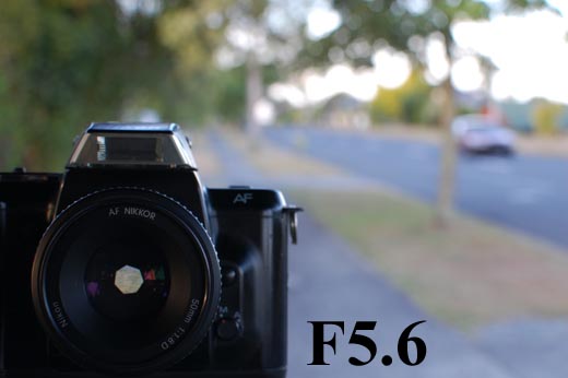
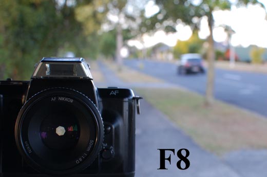
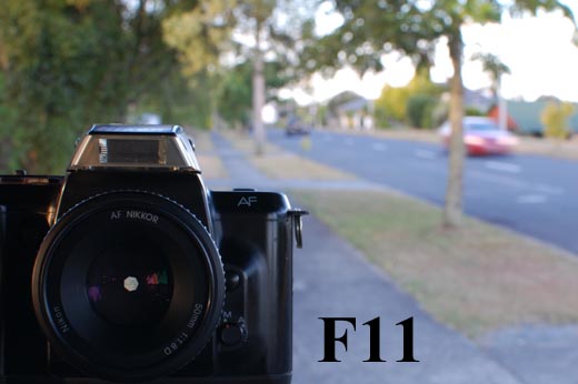
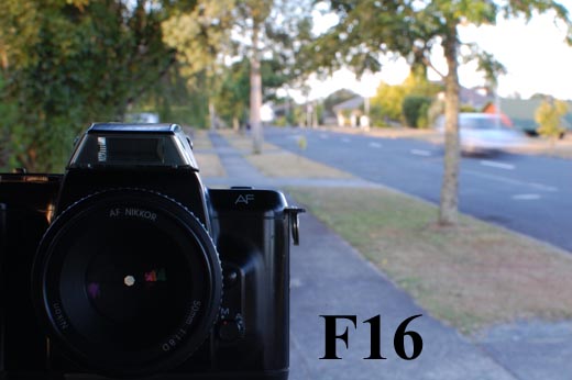
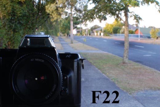
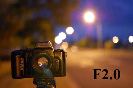
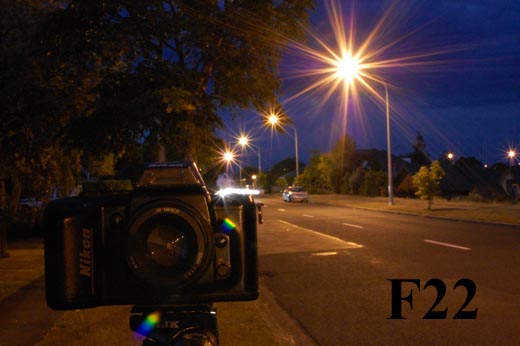
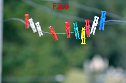
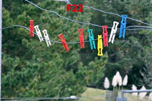
These images were taken while writing my ebook. These are the images used to show the difference between various aperture settings. This is the position that the aperture in the lens moves to when the shown aperture is selected and the shutter release is pressed.
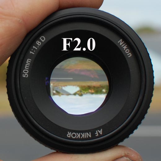
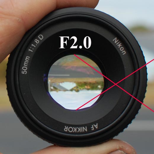
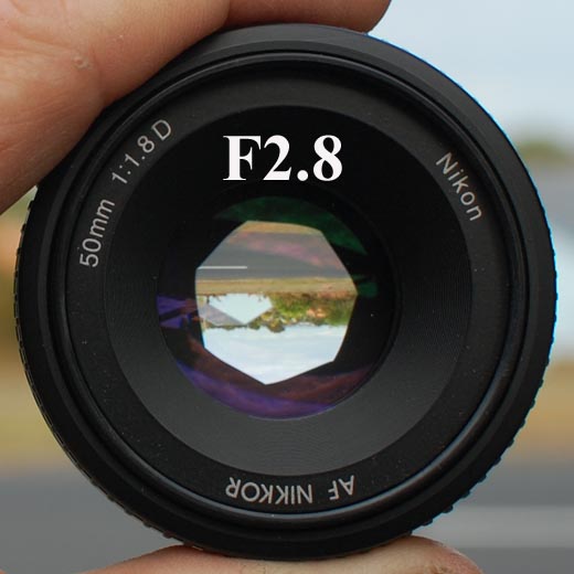
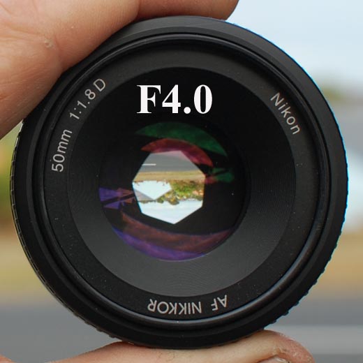

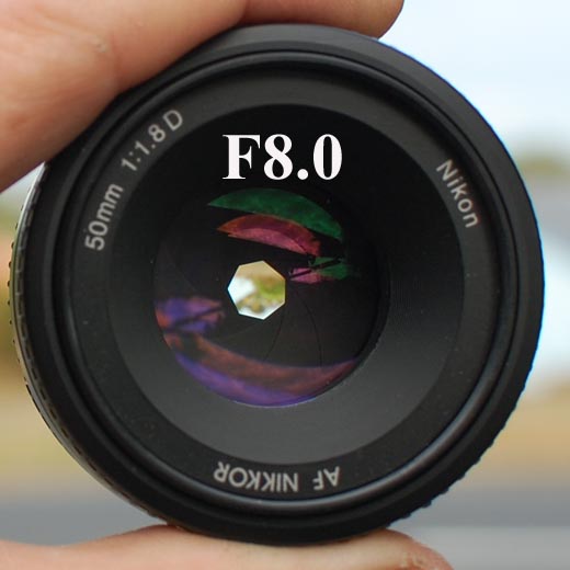
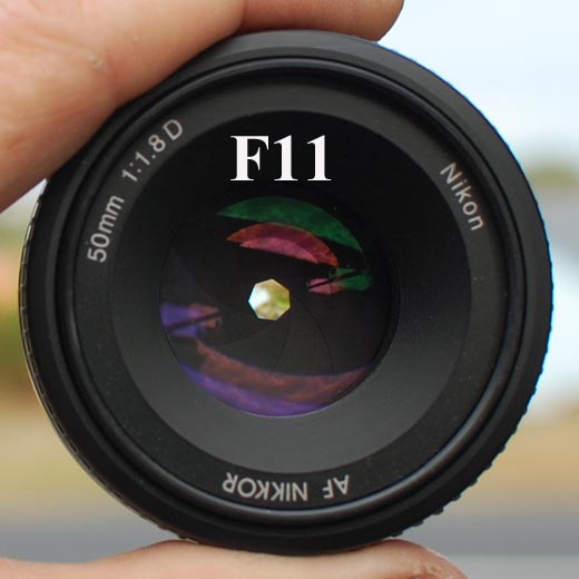
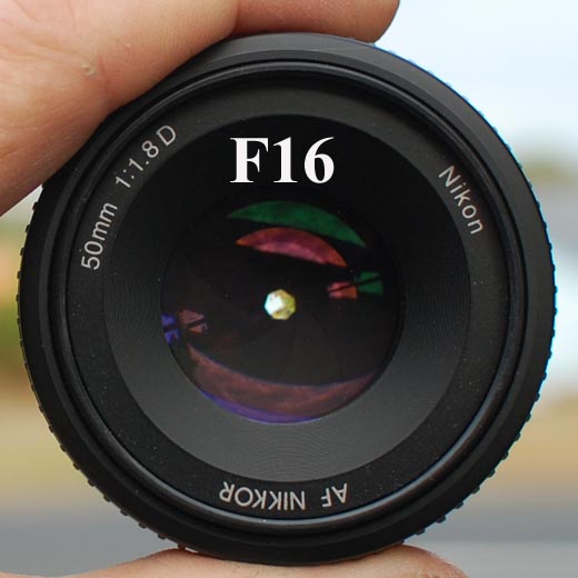
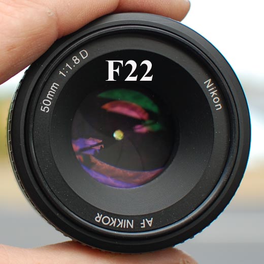
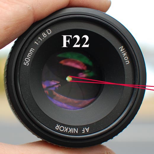
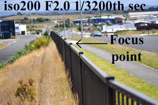
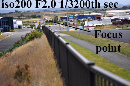
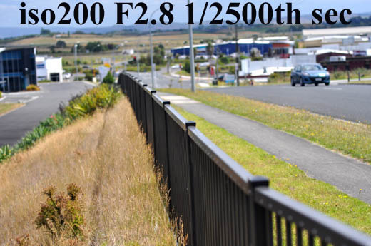
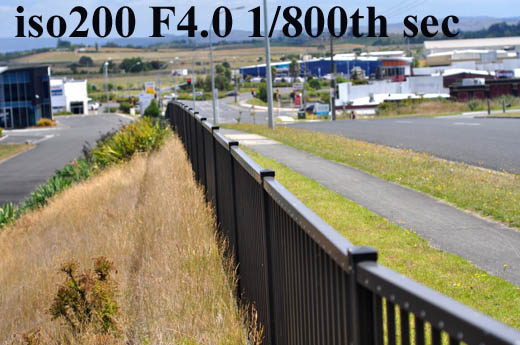
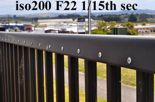
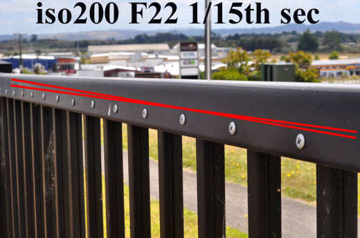
Then I took some photos with the lens mounted on a body and set to the aperture I was using on the camera I was actually taking the photos with - so the aperture you see in the picture is also the aperture the image was taken at.
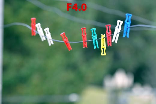
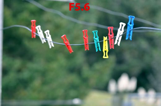
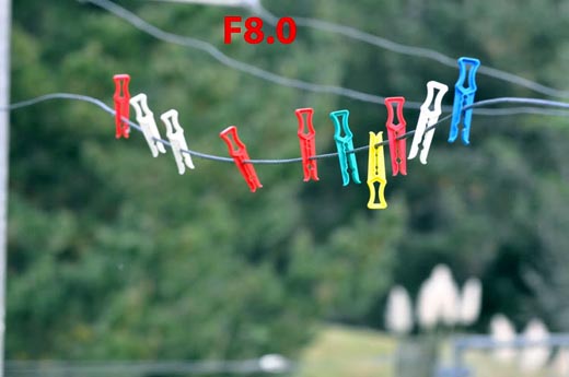
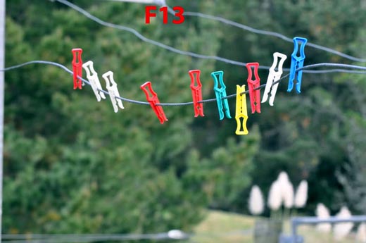
Here are some samples taken with the 70-200mm lens.

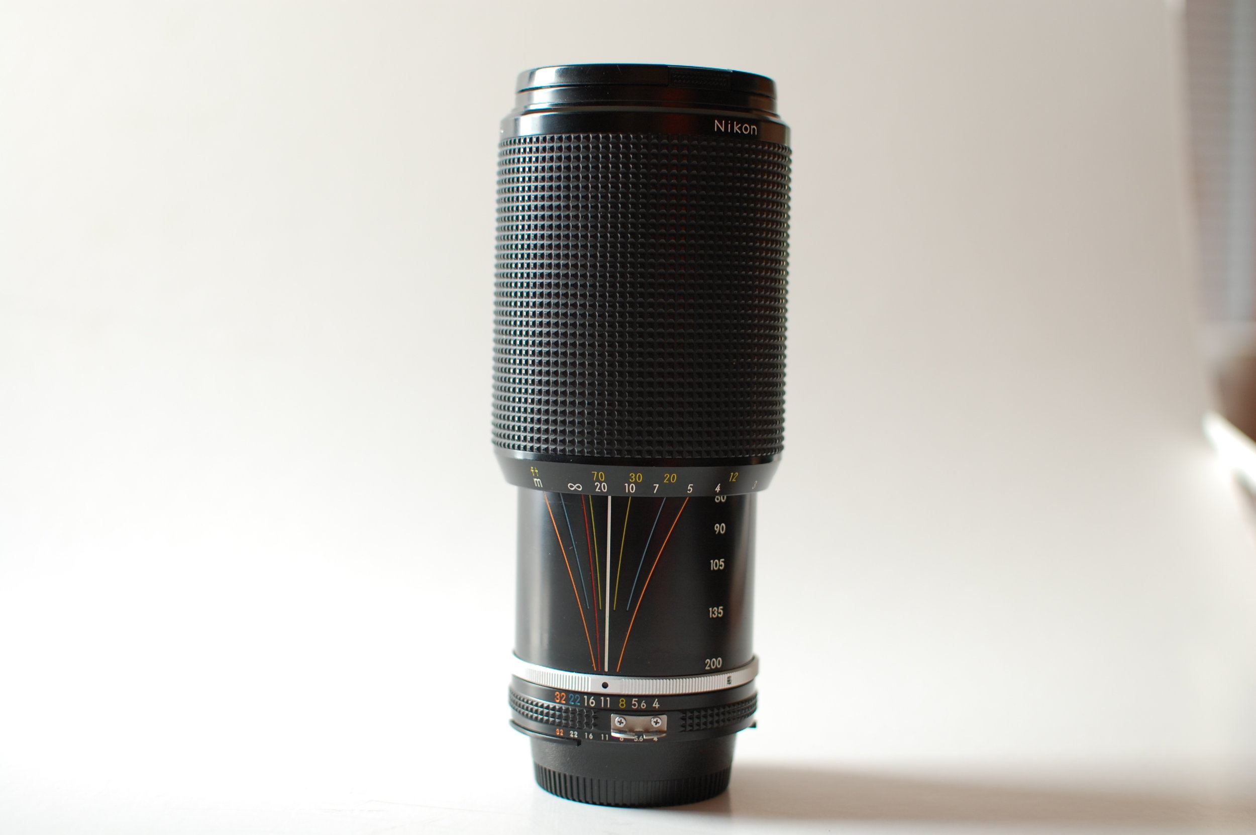
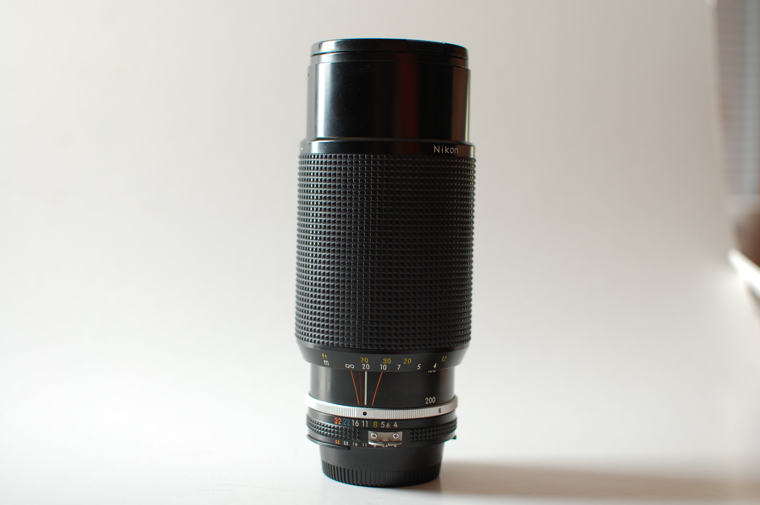
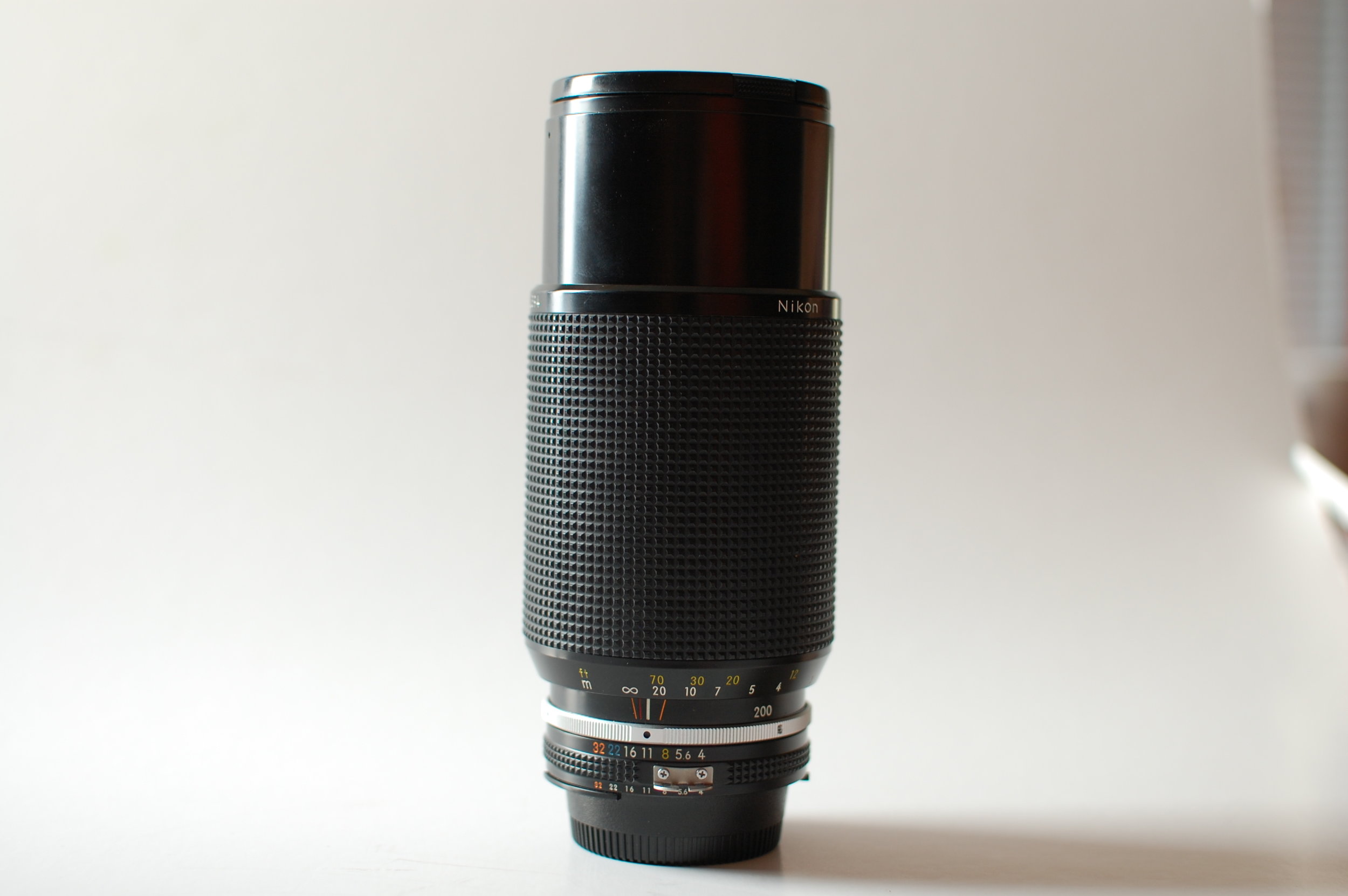
Here are some pictures of an older lens that shows aperture and depth of field at the various focal lengths and focus distances. Basically the white line shows the distance you are focused on and the other coloured lines match up to various apertures [the red line is for infra-red focus]. For example the “f22” is orange and there are two orange lines on either side of the white line. That shows what will appear to be in focus if you were to choose f22 to take a photo. Notice as well how the depth of field scale changes as the lens moves from 80mm to 200mm - less and less is in focus which is why the longer focal lengths give better blur in the background.


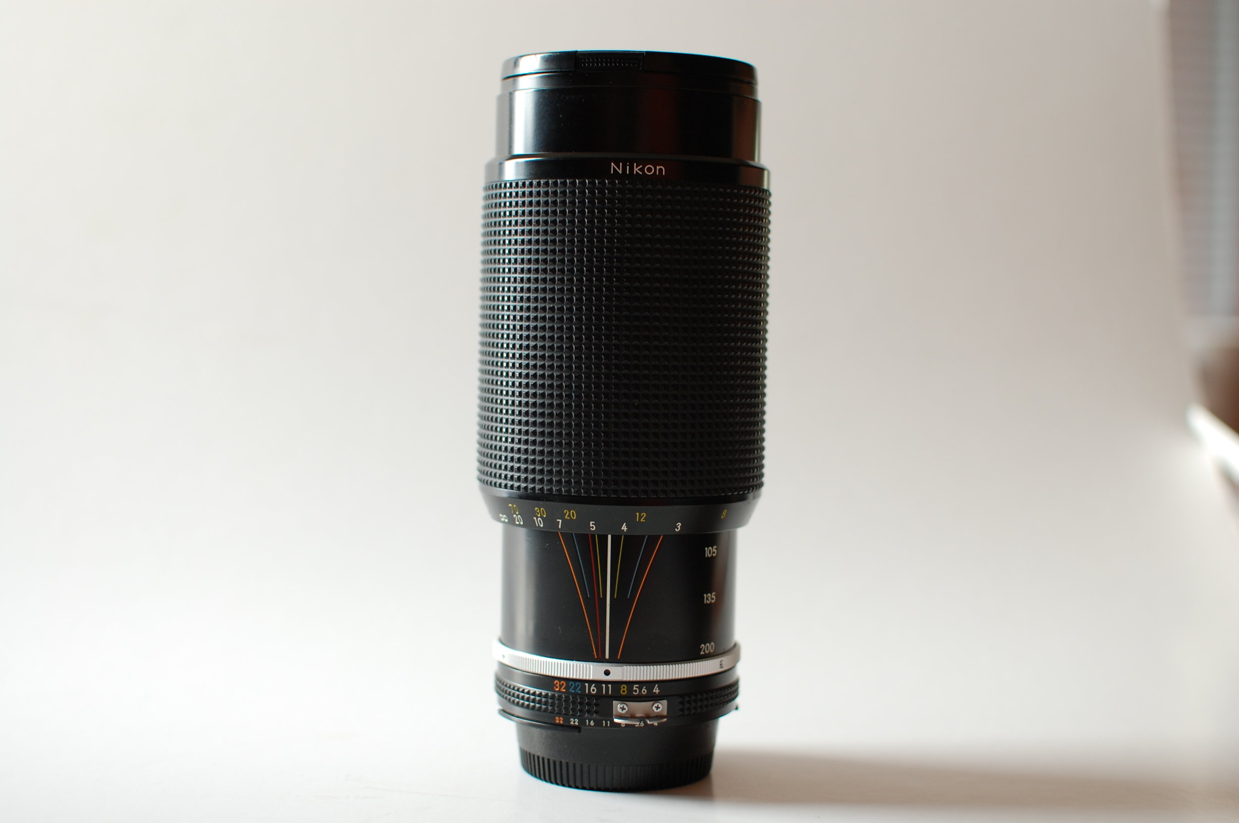
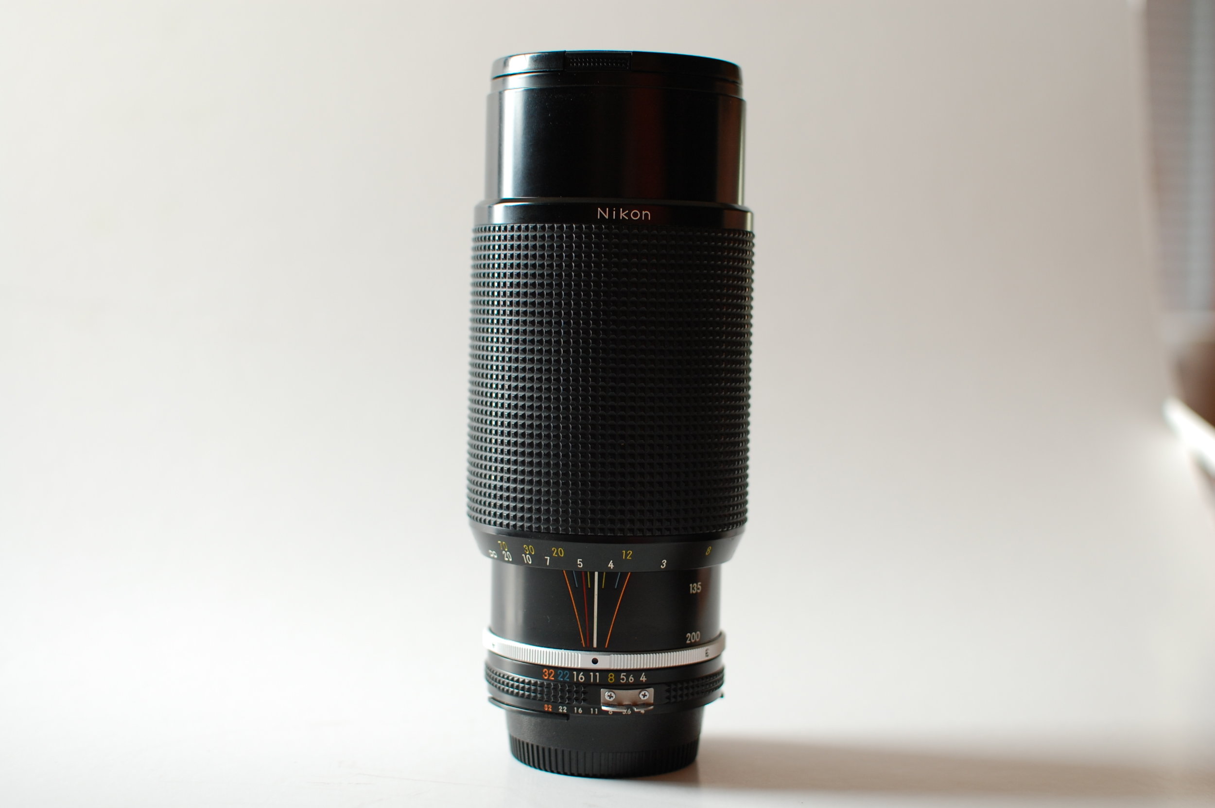
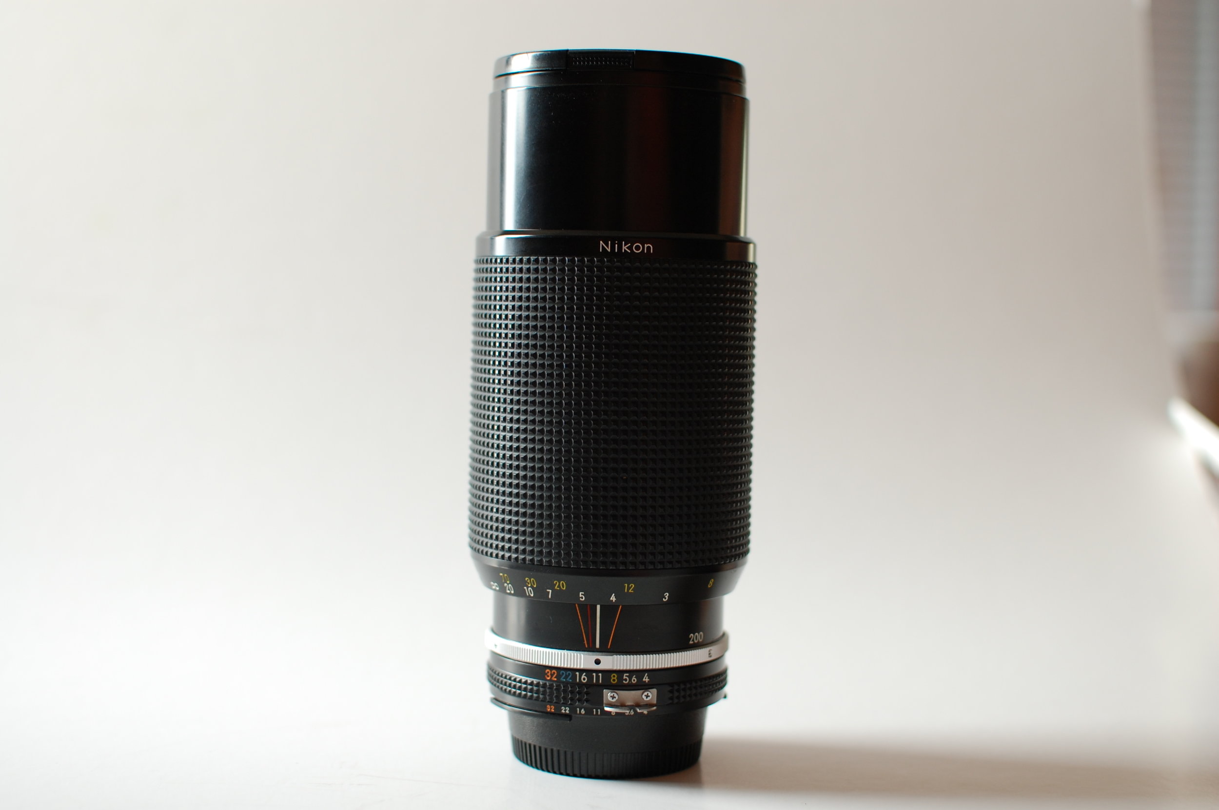
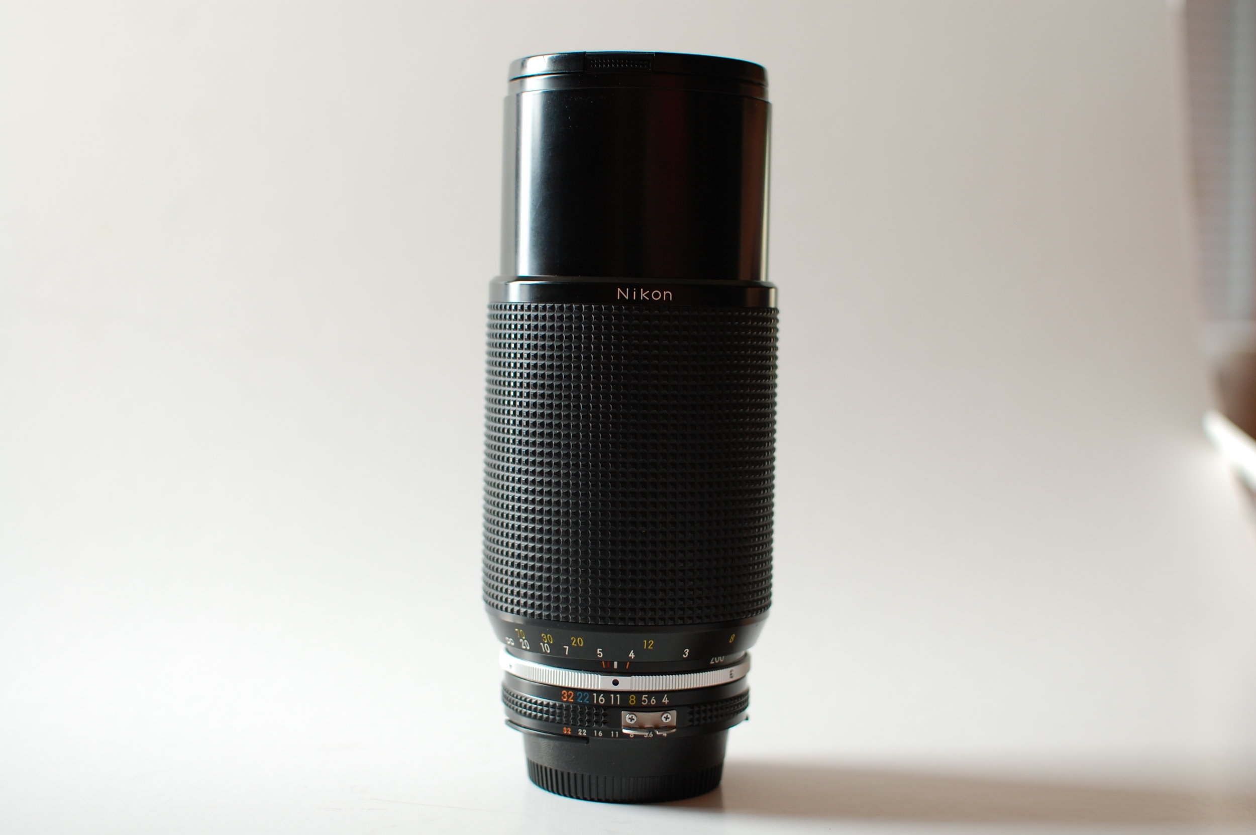
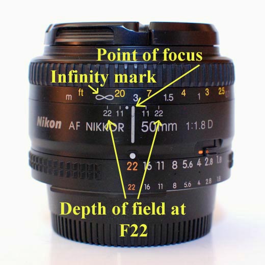
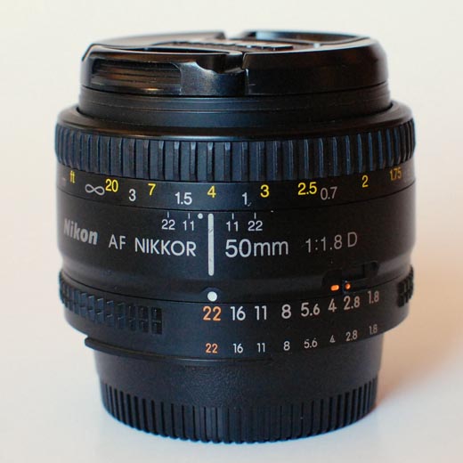
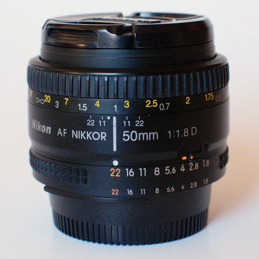
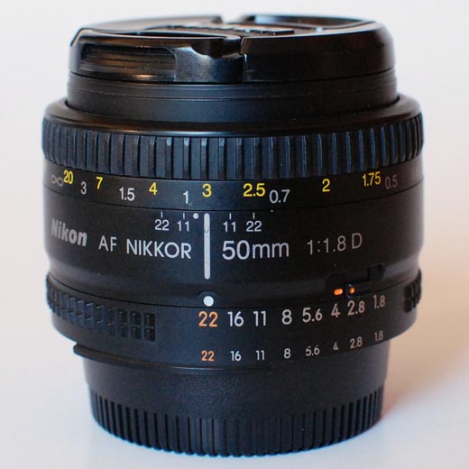
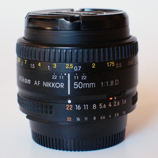
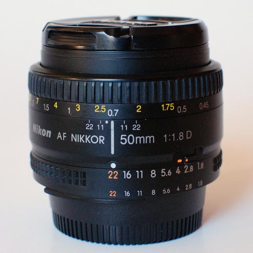
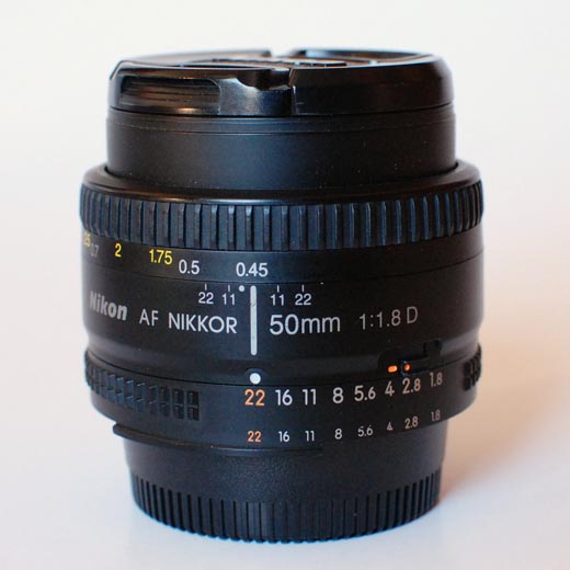
The older 50mm f1.8D has a depth of field scale as well if you look carefully at it. It doesn’t need lines like the 80-200mm because it doesn’t zoom. Looking at the first image - if we focus on 3m then at f22 the picture will look focused from infinity to around 2m. As we focus closer however the area in focus decreases and eventually at the closest focusing distance we only have a couple of cm “in focus” even at f22.
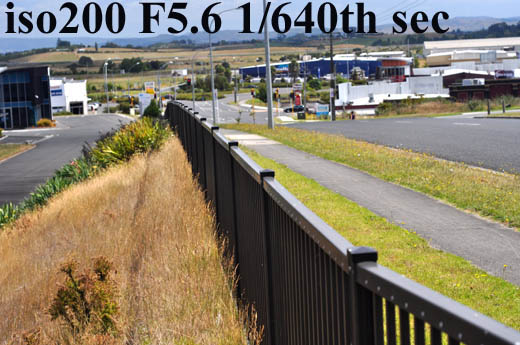
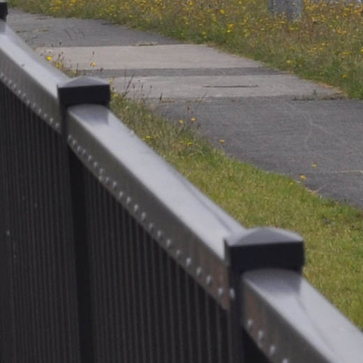
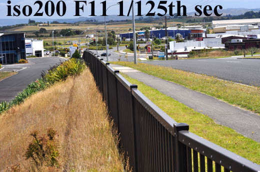
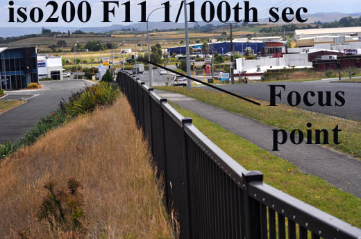
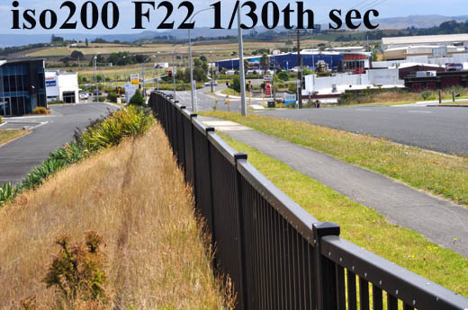
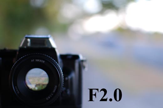
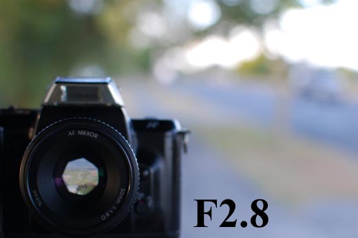
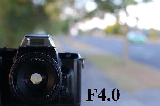
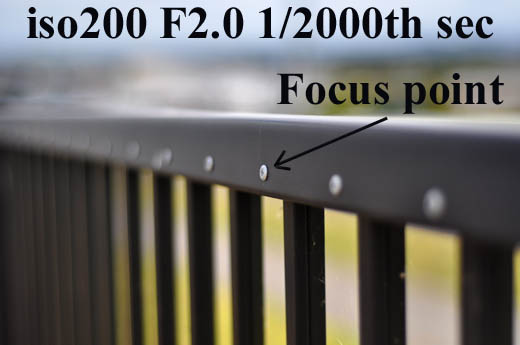
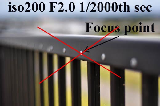
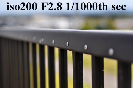
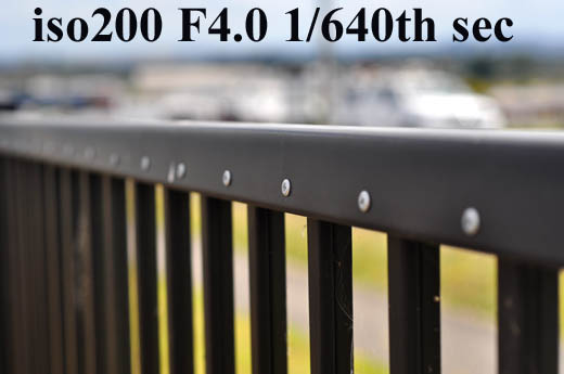
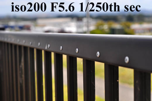
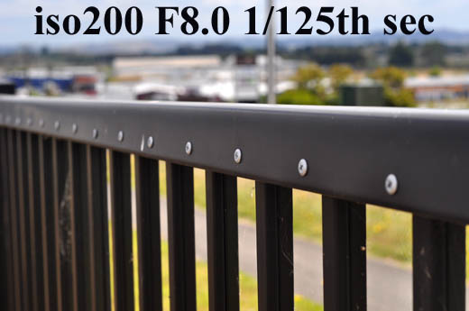
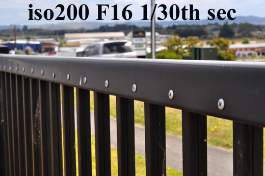
Here are some samples from the 50mm lens at various apertures with the focus point in the same place on a fence.

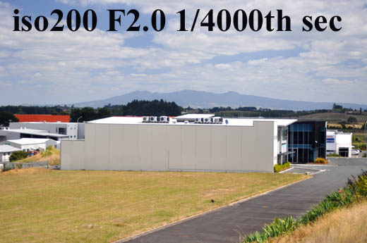
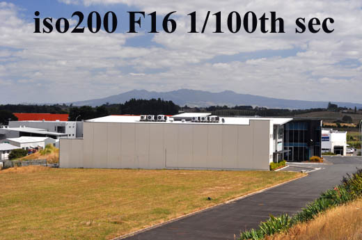
And some images taken with the focus point further away - when your subject is more than 20m away it’s hard to even tell the difference between f2 and f16.