Exposure compensation
Once you have an idea what correct exposure is and how the different metering modes work you will realize that no metering mode is perfect in every possible situation. A metering system doesn’t know what the lighting is like. It sees something white and assumes it is gray in bright light so it backs off the exposure. It sees something black and assumes it is gray in dark lighting and increases the exposure – all it knows is ‘average gray.’ Though Nikon’s color matrix metering generally knows a little more than that, spot and centre weighted and most other cameras’ pattern metering systems only know one thing ‘average gray’. And that is what they aim to achieve regardless of whether the subject is black or white or anything in between.
This is where exposure compensation comes into the equation. Once you have chosen a mode to work in and are comfortable with judging when exposure is correct you can start using exposure compensation to fix images that aren’t properly exposed. If you take a picture and can see it is definitely not exposed correctly then all you need to do is push the little +/- [EV or ‘exposure value’] button on your camera, usually near the shutter release button with Nikon DSLR’s, and turn the back dial while holding that button down [depending on how your particular camera works] and take another picture, of course. If the results are still not where you want them try another adjustment until it’s right. As you do this more often you will find it easier to get close to the correct exposure with only one adjustment.

Remember that a ‘stop’ is either twice as much or half as much light depending which way you make the adjustment. Most cameras are set to dial in 1/3 of a stop increments while some are set at ½ increments. If your camera has the ability to choose between the two then it is best set at 1/3 increments because that is generally how the shutter speed adjustments work as well. That way if you are in manual mode and adjust the shutter speed 3 ‘clicks’ then you know that adjusting the aperture 3 ‘clicks’ in the other direction will result in the same exposure. Once you have made an adjustment the rear LCD, and usually inside the viewfinder, shows a +/- symbol to remind you that the metering is set to behave differently.
Let’s go back to the image of the white paper half in sunlight and half in shade as an extreme example.

We’ll start by adding a reason to ‘take sides’ between light and dark. Let’s add some subjects. This is what they looked like on the page as the clouds blocked the sun for a while.

Once the sun came through the clouds again I used aperture priority mode and took a picture and the camera chose 1/800th sec. at ISO 100.

The first image was taken with the active focus point on the roach on the right of the image. I had my camera in matrix metering mode and moved the active focus point over to the mantis on the left and the metering system realized my subject was now in the dark but was not prepared to change by too much. As I’ve noted in the past Nikon’s matrix metering system seems to have a cap of 2 stops that it is prepared to change in any situation. [With most of their newer models, that is]. Centre weighted metering would have maintained exactly the same exposure for both images.

So now we see that the shutter speed dropped to brighten the dark areas and this resulted in totally blown highlights. In this situation we have no choice, we have to blow the highlights to get our exposure right for the subject we have selected. Since the subject is still too dark, remembering that it is on a white surface, I dialed in ‘+2’ EV compensation so the shutter speed dropped to 1/50th sec [two extra stops of exposure gives us 4 times as much light so we go from 1/200th to 1/50th]. Our histogram now shows the whites in the shaded area as just above ‘average gray’ judging by where the histogram is sitting. We can see the thin spike on the right of the histogram representing our blown out whites on the right side of the image.

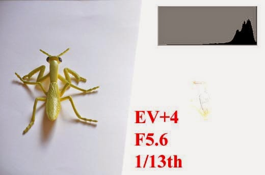
I dialed in another two stops of compensation resulting in a total of ‘+4’. Two stops down from 1/50th is 1/12.5th. Shown as 1/13th. Now the left hand whites are shown as a hill sloping down to the very right of the histogram, just before the spike caused by the right hand half of blown out whites. Right where it should be to give us a white with some details and expose our subject correctly as well. This has come at the cost of a total loss of detail on the right hand side of the image.
These are the decisions we have to make in a really high contrast situation. Which is the subject? What are we prepared to sacrifice to get the subject correctly exposed and what options do we have anyway? The camera doesn’t know what our subject is and where it is in the image except what it figures out based on the focus points [when in matrix or pattern metering mode]. The camera is disadvantaged in the fact that it cannot read our minds [some would be a shorter read than others]. That is why cameras have EV compensation buttons, to be used when necessary!
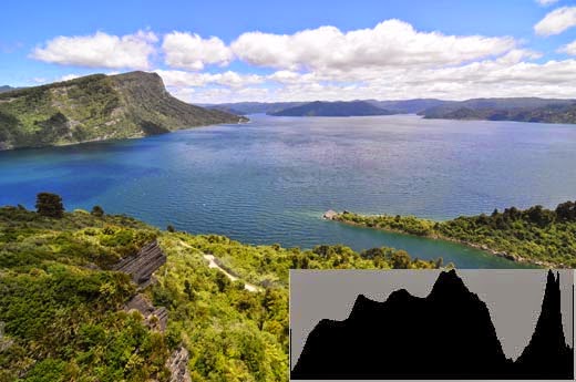
Here is a more realistic ‘real world’ example, an image I took a few months ago of Lake Waikaremoana [try to say that without hurting yourself] in New Zealand. When I checked the histogram it was bunched up to the right a little too much and had a thin spike at the far right meaning ‘white with no detail’, Matrix metering saw all the dark greens and overdid the clouds a bit while trying to expose properly for the greens.
As with previous situations like this, with this particular camera and metering system, I’ve become accustomed to dialing in compensation of ‘-0.7’. Hold down the ‘+/-’ button and turn the back dial until the exposure shows ‘-0.7’ which is usually two out of three lines on a scale showing 1/3 increments, it’s actually 2/3 which is 0.666666 , rounded off to 0.7. Some cameras have an LCD screen on top that actually shows ‘-0.7’. In this particular case I felt that it was more than 1/3 over, perhaps close to 1 stop over, but 0.7 gave me a happy medium to try, and in this case it worked first time.
It may not look much different on screen but the first image would be rejected from a stock library because the spike indicates an imperfect exposure. The second image was accepted when submitted.
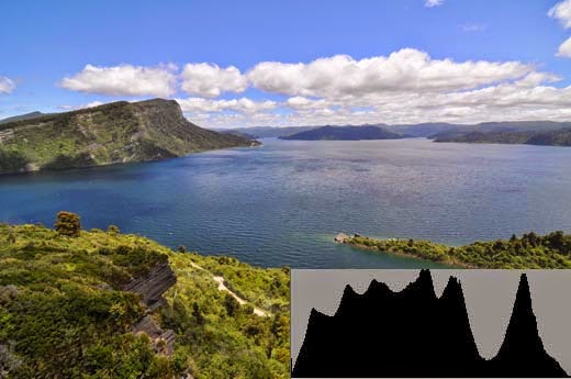
Note how the histogram is no longer bunched up against the side, no spikes showing overexposure? And if you analyze it for a while you start seeing what the different ‘hills’ represent. The solitary hill on the right is predominantly bright sky and possibly includes the brighter reflections on the surface of the water. Histograms very seldom look like the ‘ideal’ the meter aims for because we seldom photograph something totally plain so it pays to have a look at the histograms you are getting and to learn to read the information and decipher the exposure in varied situations. Just remember ‘pitch black on the left, pure white on the right and everything else in between’.
Of course it’s not always negative compensation that we have to use, it depends on the scene and what ‘fools’ your metering system when it tries to produce an ‘average gray’. Here’s a shot with a lot of white in it, a bright lighthouse and clouds in the background. Our metering system decides things are too bright and backs off the exposure resulting in an image with a lot of detail in the whites but underexposed grass and blue sky, which should be our real ‘average gray’ tone.

Look at the ‘hills’ just left of the centre and to the right of centre. That’s supposed to be whites, we have a lot of white in the scene and that should give us a hill touching the right but instead it’s to the left meaning that the image is badly underexposed.
In this case it was so badly underexposed that I dialed in ‘+1.7’ and could have made it ‘+2’ or even ‘2.3 but anyway it made the image look more like it should have been, ‘next time’ I will check the resulting histogram more closely but it’s still a huge improvement on the initial image where any metering system would be fooled by the massive amount of bright light in the image.

Have a look at the resulting histogram above. See that gap on the right that we could still use? There is also a small spike at the end, which is the unavoidable spike of the bright light reflecting off that window. There’s no way we can save that because it’s the sun’s reflection and it is totally acceptable because a reflection like that can’t have detail. Think about the image in the chapter on exposure with the house with the bright white wall. If the rest of the image is properly exposed we sometimes have to ignore a minor imperfection elsewhere, we can’t always get everything properly exposed, due to the limits of the sensor’s dynamic range we dealt with earlier as well. The sun and its reflections in a normal image will always be a spike of white with no detail but we can still use that space on the right before that to push our histogram over even more and expose further to the right. As mentioned adding another 1/3 to 2/3 of a stop of exposure would brighten the image further without throwing away much detail and would result in a more accurate exposure and better image quality and print. The resulting histogram would fill that gap.